Peter Pan
I worked with a team to create a new design for the 2019 Peter Pan Bus app. This prototype of the app was a complete remake to fix the problems found after thorough research. Check out the prototype below and the process our team went through to create it.
ClientPeter PanServicesUser ExperienceYear2019
Functionality and Scope
Peter Pan Bus Lines is a public transit bus company that has been around since 1933. The company strives to stay relevant amongst its competitors servicing over four million passengers along the Southern, New England, and Mid-Atlantic regions. In 2015 the company made the Peter Pan app where passengers could purchase tickets online amongst a few other functions. Since the app launched it has not damaged the brand of Peter Pan, but it has not helped the brand as most apps do. The app has had issues since its launch with very minimal updates and users have made it clear that it needs improvement.
After research and observation, my team worked to improve the user experience of the app in the most significant way. The app in its current state makes it hard to navigate to specific tasks. Buying a ticket seems to be the only thing on the app that is not a headache and even that could use some fine-tuning. The app has a bus locator that doesn’t help in real-time as well as a perks and rewards page that doesn’t allow you to log in to know what you have earned. The app is basically a menu that segues its users to the mobile website. We plan to make this app an actual app and give it its own interface.
Research
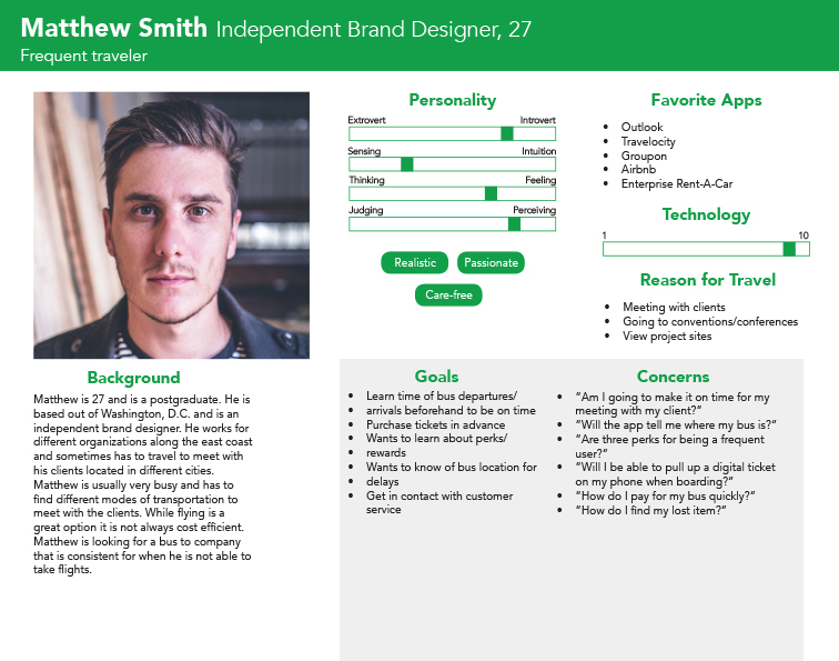
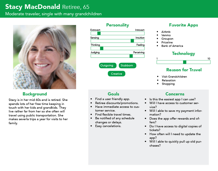
Our user group are folks who travel fairly frequently and are always keeping an eye out for deals, easy app functionality, and access to customer service should an issue arise. The PeterPan Bus app in particular leaves our user group frustrated and often clueless as to how to use the app. We’ve chosen to focus on a relatively wide range in terms of age: Millennials, Generation X, and Baby Boomers. Casting this wide net, we were able to make the best assumptions for how the app should operate by making decisions that are most inclusive to all levels of computer (application) literacy. By eliminating many quirks and errors the PeterPan app currently has, it will make purchasing tickets much more viable for a larger spectrum. The user group that we are applying this research to are relatively seasoned travelers and will usually be able to solve app problems on their own but with great difficulty. However, this is not always the case, therefore it is crucial that many changes be made in order to keep customers returning to PeterPan for their travel endeavors.
Informal Analysis
We took a look at the app to see what issues could be found casually before applying any usability principles to the app in its current state.
a. Outdated and Inconsistent design
The first home screen of the app has huge buttons for the options with large text, and no navigation bar. The buttons on the home screen are rounded, while if you go to another page, the buttons are not as round. This app has too many fonts (counted 8) throughout the app which could be confusing and/or unappealing to the user.
b. Logging in
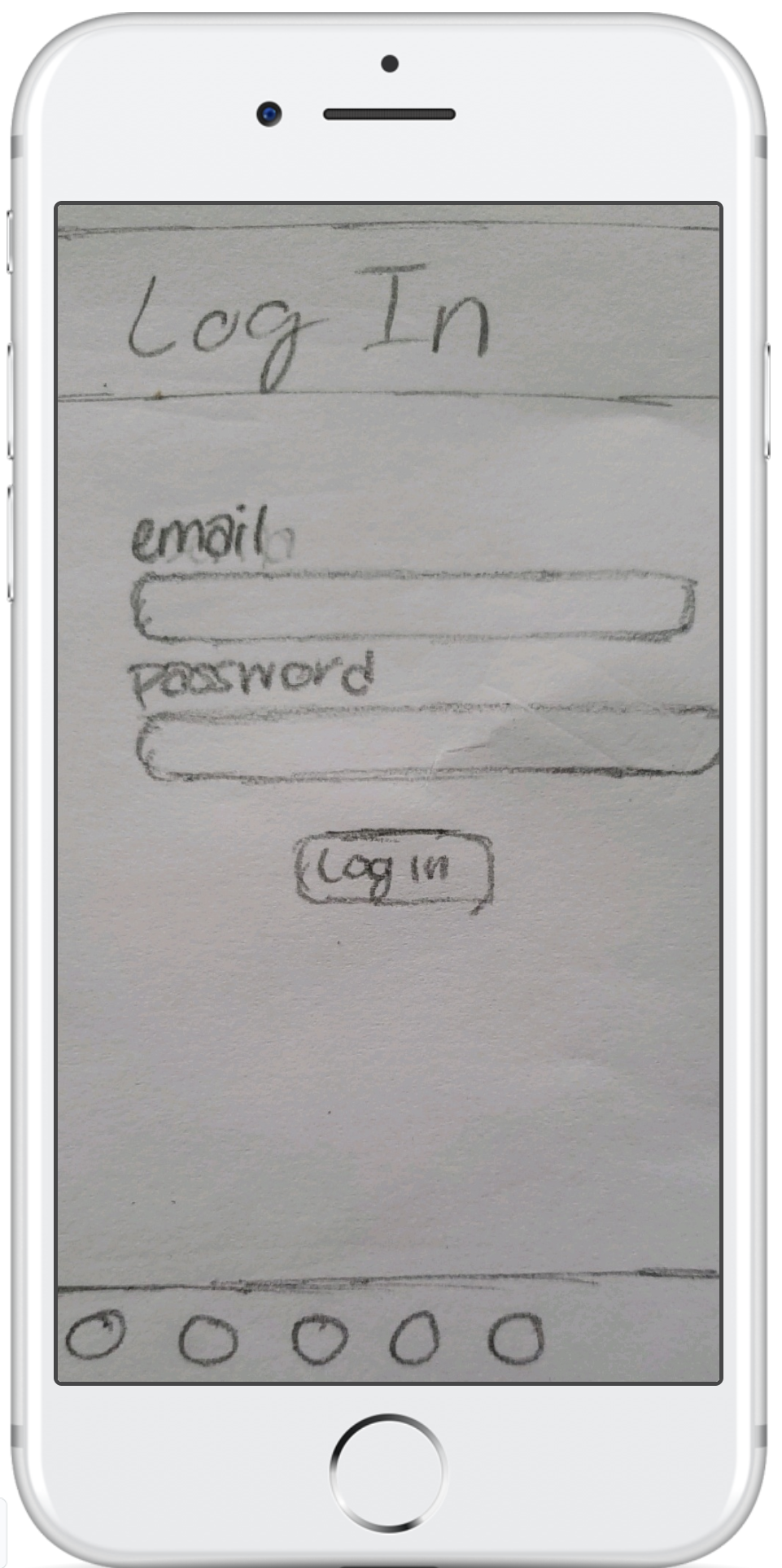
To log into this site, you simply have to put in your email address and password, then click “Log In,” but this issue is that you have to log in to this app by typing in your email and password every time you open it. It doesn’t give you the option to save your login information, log in with a fingerprint, or log in with facial features. This issue also applies to signing up for their “Perk Rewards” because even if the user is logged in, they still must sign up for Perk Rewards by using the same information that was required to create an account. There should be a system where users do not need to sign up for rewards if they have already created an account.
c. Navigation menu
This app has a big issue with its navigation system. First, there is no navigation system on the home page. This gives users fewer options than they would have if the navigation system was there. When you click on something to exit the home page, a hamburger menu appears on the top left side of the app, displaying a menu to navigate the app. When the user clicks this nav system, it appears on the left side of the screen, with a black background behind the company’s logo, and a white background behind the menu items.
This app actually has two different menu systems within it because if you click some menu items like “Locate my Bus,” the hamburger menu changes to the top right side of the screen, and when clicked, it is a drop-down menu with a low-opacity background. This navigation system has almost all different menu options than the previous navigation menu. This caused for a bad user experience because users can get lost in this app.
d. Buying tickets
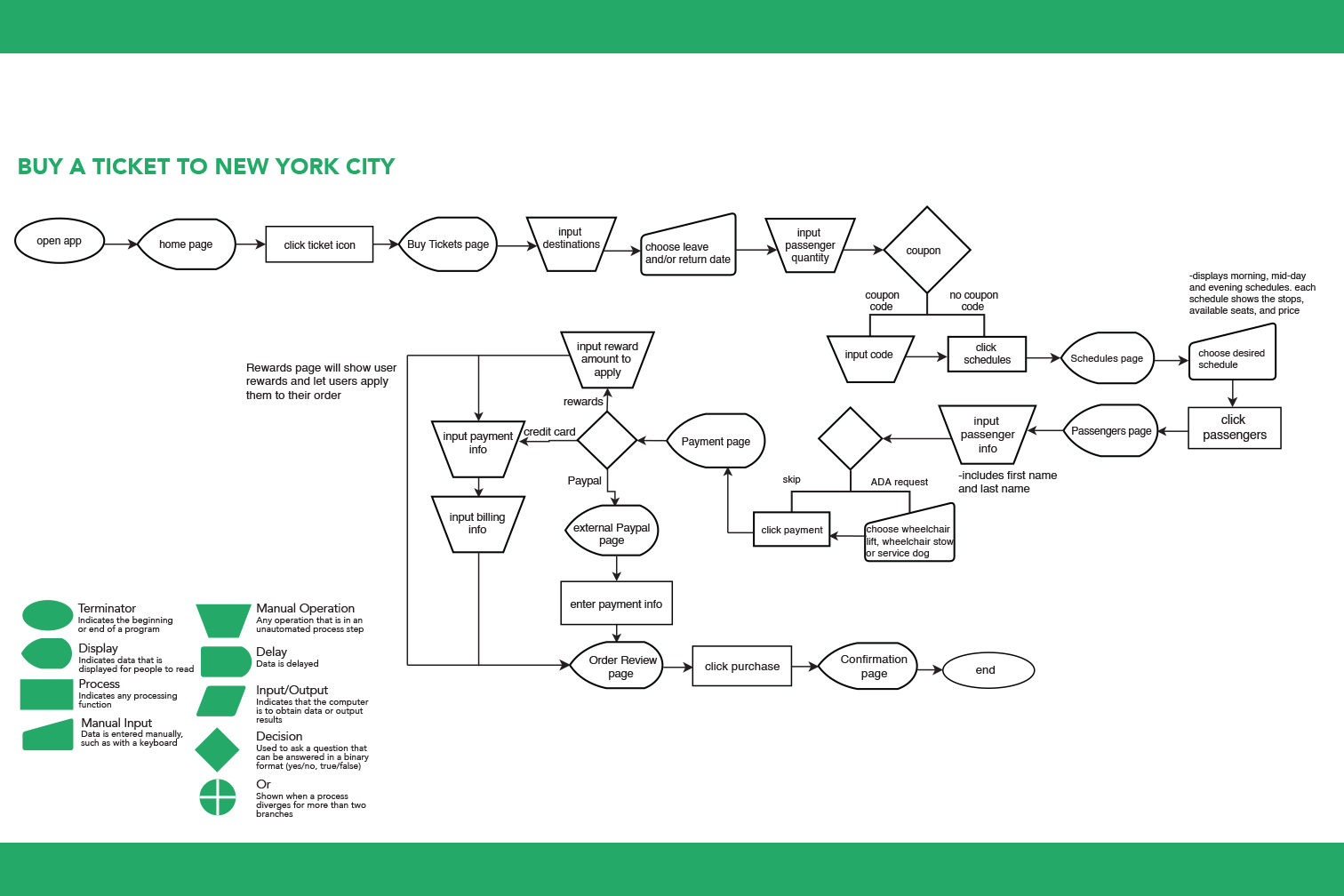
This app is supposed to make it easier to buy tickets, but it instead has two different pages for buying tickets. One page is the actual app’s version of the buy tickets page from the left side navbar, and the other version is the mobile website buy tickets page from the right side navbar. There should not be two different pages from two different navigation systems for buying tickets because this could frustrate and confuse the user and cause them to have a bad experience on the most important part of the app.
e. Bugs
There are a lot of bugs in this app that makes for a bad user experience and poor aesthetic. If a user slides their finger down on some screens, random graphics that belong on other pages appear, and sometimes the navbar slides down and shows other images too.
Formal Analysis
We compared the app’s usability to Jakob Neilsen’s 10 Usability Heuristics for User Interface Design. While we had a general idea of what issues could be fixed, these principles helped us find the negatives and positives of this app, additional issues we may have missed, and how we could possibly resolve the issues. Overall the informal analysis combined with the formal analysis helped us figure out what our potential app users were currently working with and what they could be working with, in our redesign.
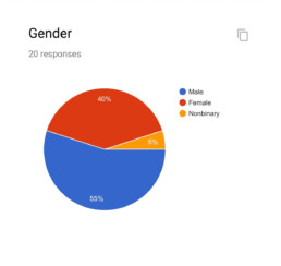
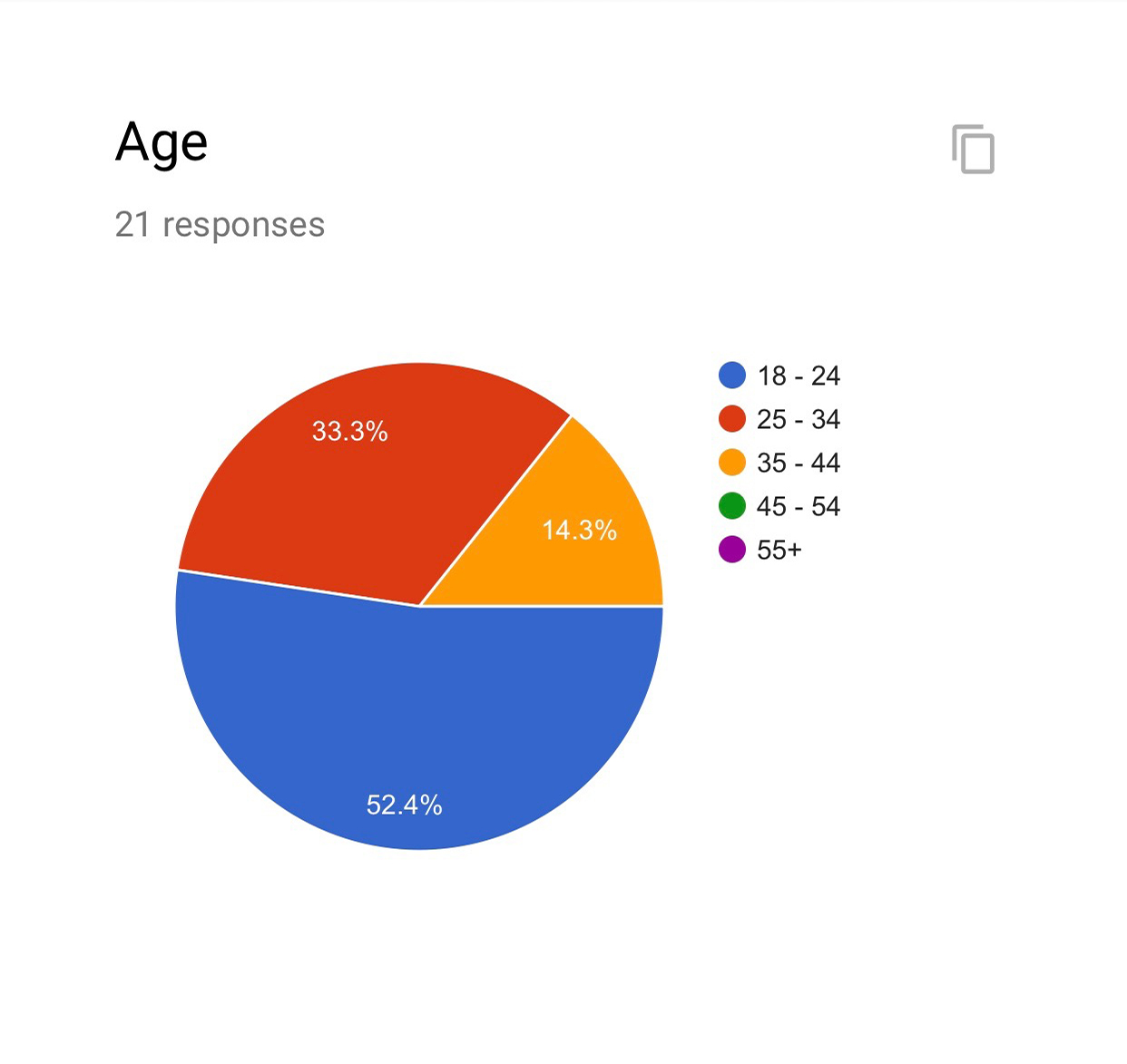
User Group
Our user group are folks who travel fairly frequently and are always keeping an eye out for deals, easy app functionality, and access to customer service should an issue arise. The PeterPan Bus app in particular leaves our user group frustrated and often clueless as to how to use the app. We’ve chosen to focus on a relatively wide range in terms of age: Millennials, Generation X, and Baby Boomers. Casting this wide net, we were able to make the best assumptions for how the app should operate by making decisions that are most inclusive to all levels of computer (application) literacy.
By eliminating many quirks and errors the PeterPan app currently has, it will make purchasing tickets much more viable for a larger spectrum. The user group that we are applying this research to are relatively seasoned travelers and will usually be able to solve app problems on their own but with great difficulty. However, this is not always the case, therefore it is crucial that many changes be made in order to keep customers returning to PeterPan for their travel endeavors.
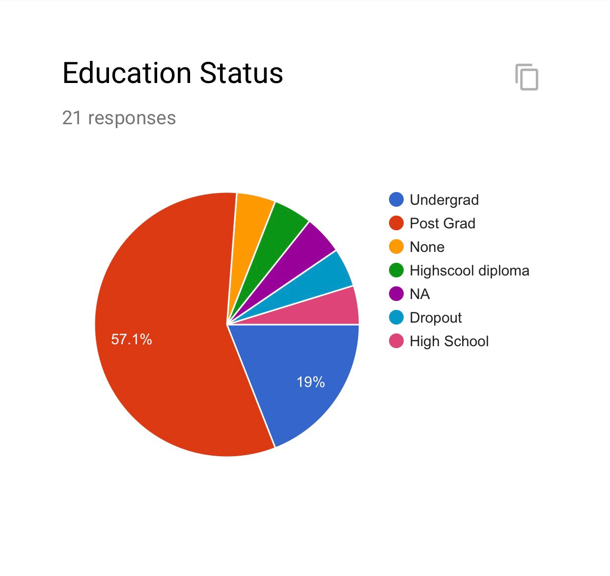
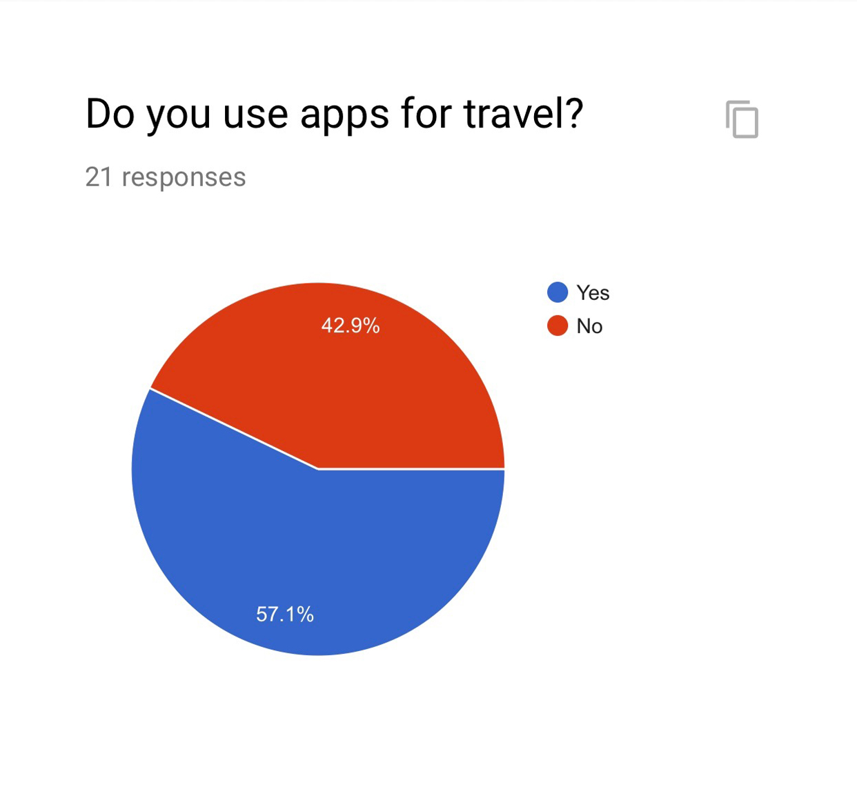
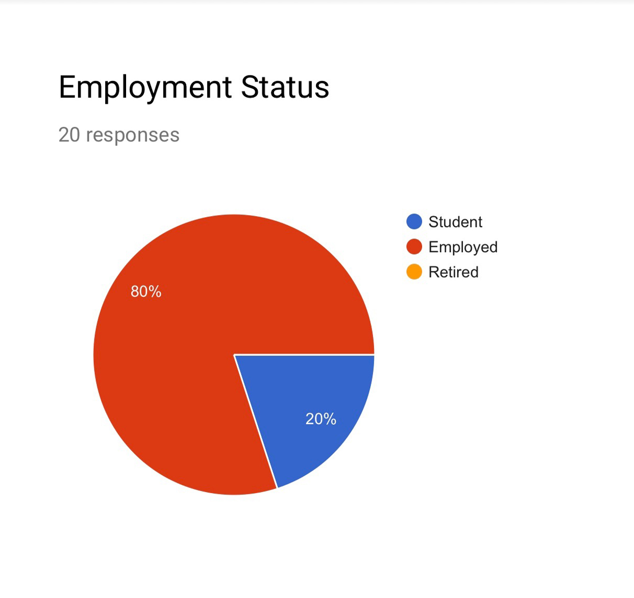
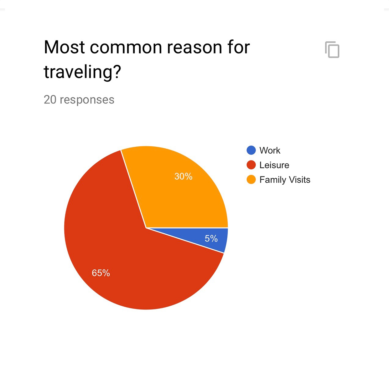
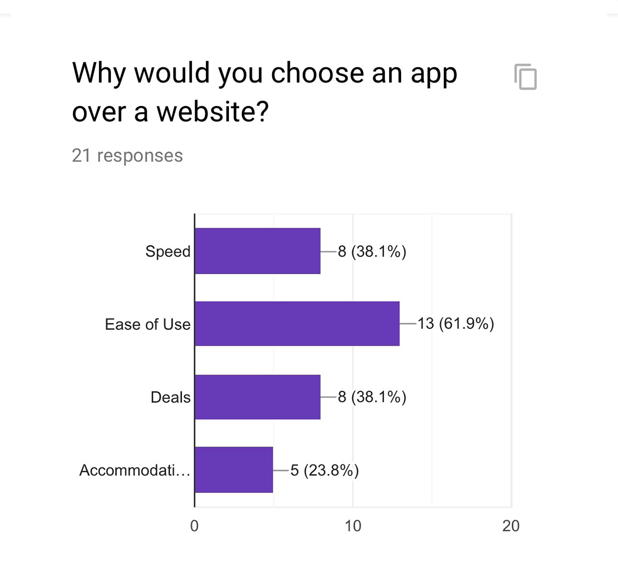
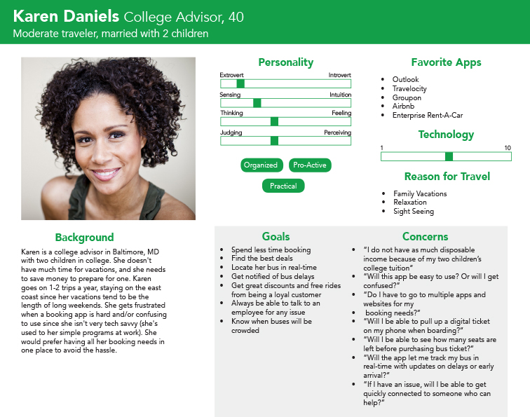
We made a Google form to better understand our potential app users. From this, and online research, we were able to create personas for the Peter Pan app,
part of the basis of the redesign.
Current State User Testing
We got 3 people to test the app at its current state for added research. We mapped out questions to ask the participants before, during, and after exporing the app to gain an understanding of their perspective and get to know our potential users better. The results from this testing helped us come up with additional tasks for fixing the app. We chose which suggested changes should be incorportated in our version of the app.
Competitor Analysis & App Reviews
On the Megabus app, users are allowed to search for a new trip on the homepage. The issue is when you want to buy the tickets, it goes to the mobile website and you have to put the information in again to make the purchase.
On the greyhound homepage, users can search for the ticket and make the purchase all on the app. Another function of the apps is the ability to track the status of trips. Greyhound does a good job of this by keeping its users up to date and providing all the information the user may need. It tells the user the initial departure and arrival time, but more importantly the expected departure and arrival time when the bus is running early or late.
In comparison, the Peter Pan app lacks in many ways compared to its competitors. Our group plans to improve on the competitior’s functions in the Peter Pan app to be the best bus app source for the east coast market. Generally, the Greyhound app takes the cake for being the most fluid and user-friendly app. Megabus and Peter Pan are tied for second since they both lack in functionality, design, and user-friendliness.
Results & Solution
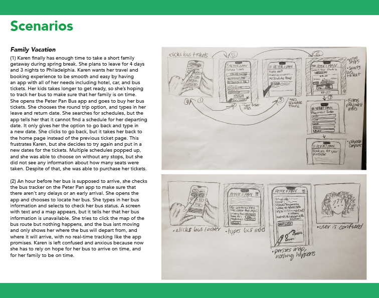
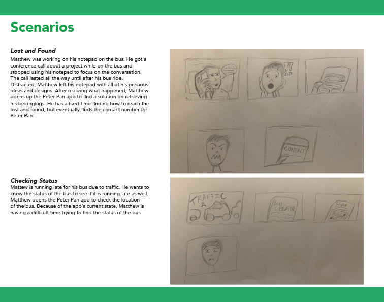
The Peter Pan app has some functionality, but not enough to make anyone’s experience pleasant when using this app. It has many errors, bugs, design issues, and interface issues. Based on our research through app reviews, users get frustrated when they cannot complete simple tasks that would otherwise be easy and fast to do. We propose to create solutions based on the issues within our created scenarios, which are the common issues seen in user complaints about the PeterPan app and other competing apps. We want to boost the user experience, brand loyalty, and ease-of-use so that users can have a positive experience when purchasing tickets, logging in, finding what they’re looking for, signing up for rewards, using rewards, getting connected with customer service, and so on. We will conduct more in-field research such as interviews and prototype testing so that we can develop the best fixes for this app’s functionality, design, and overall experience.
Task List
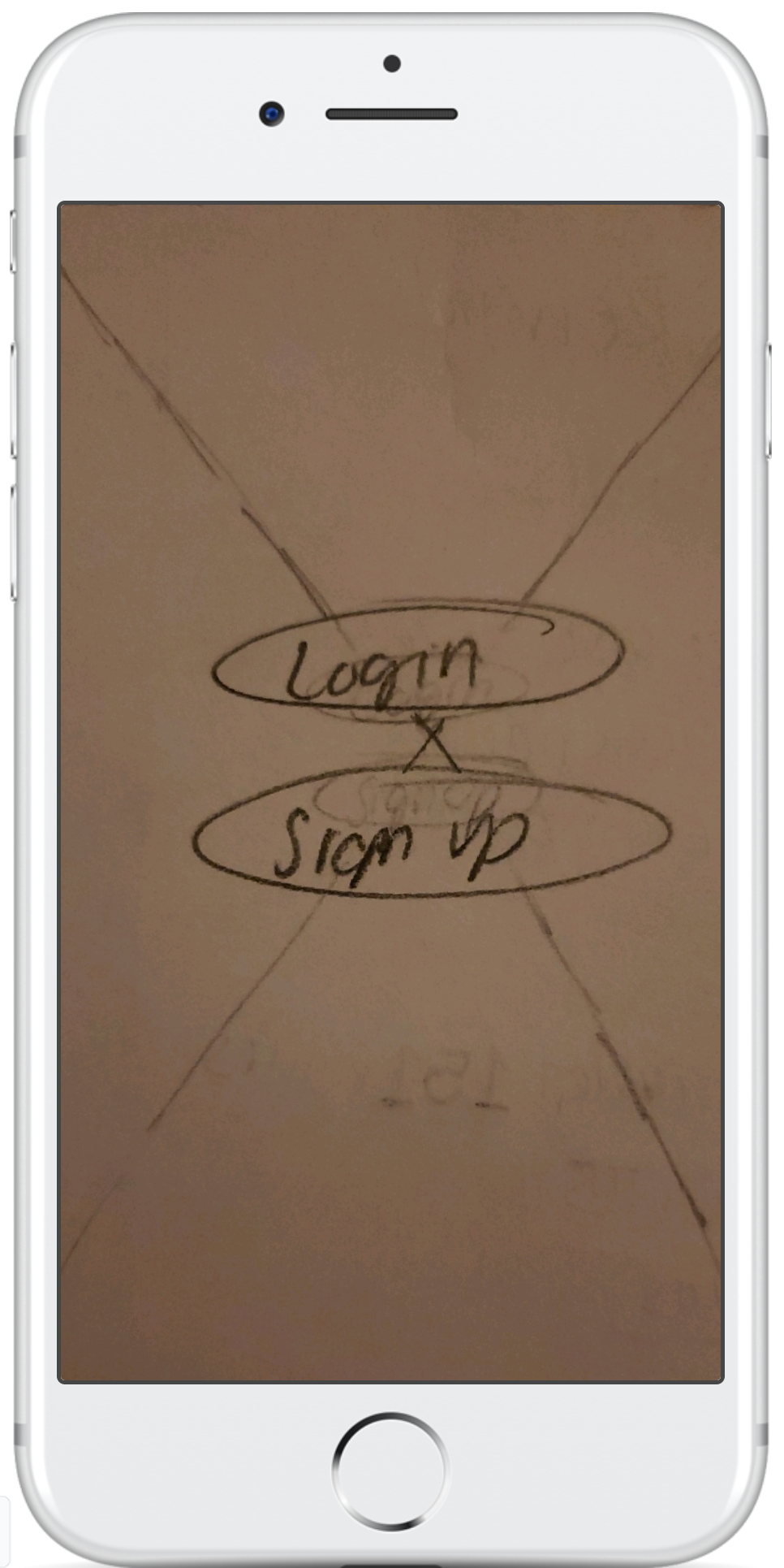
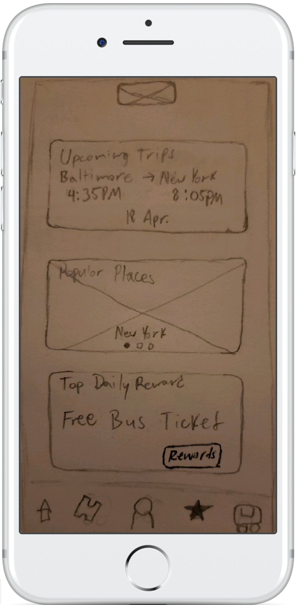
• Home screen needs a navbar and current buttons taken off the screen, replace them with a log in/sign up screen
• Create a back button on every page that needs one
• Delete one navbar and combine the info from both to just have one navbar
• Take away paragraphs on pages and turn them into information icons where needed
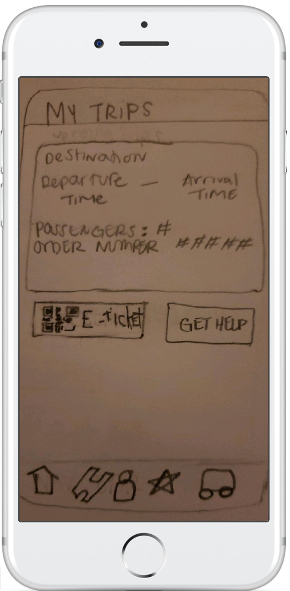
• On the order page, make past and current orders pop up instead of typing in their order. Give them options to filter their search.
• Change wording
• Make design modern and sporty
• Take away extra graphics that pop up
• Turn tabs in the ticket purchase page into dots.
• Ensure navbar is in the same place on every page
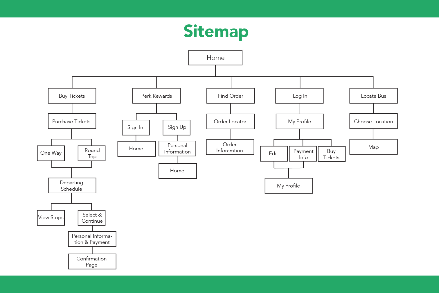
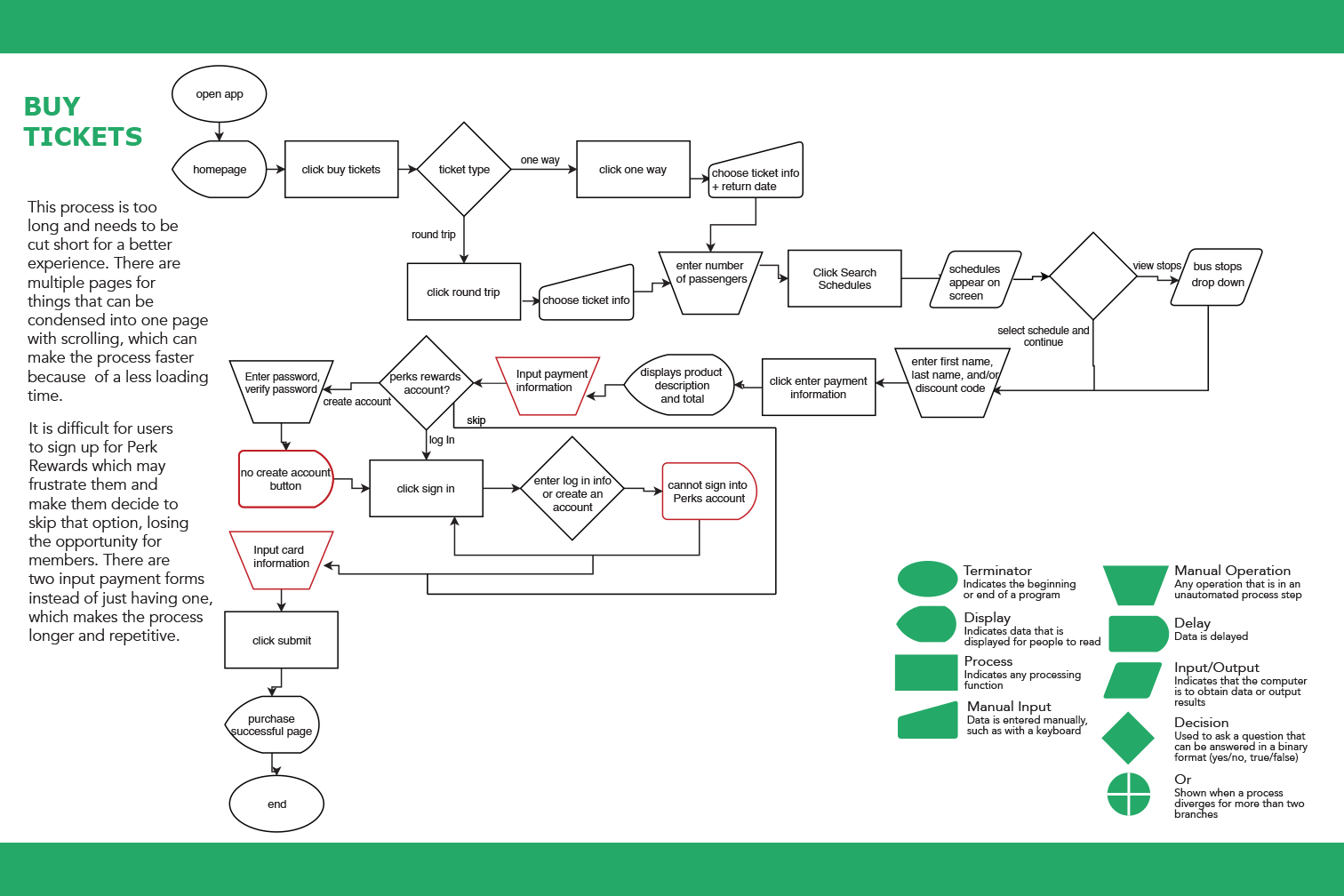
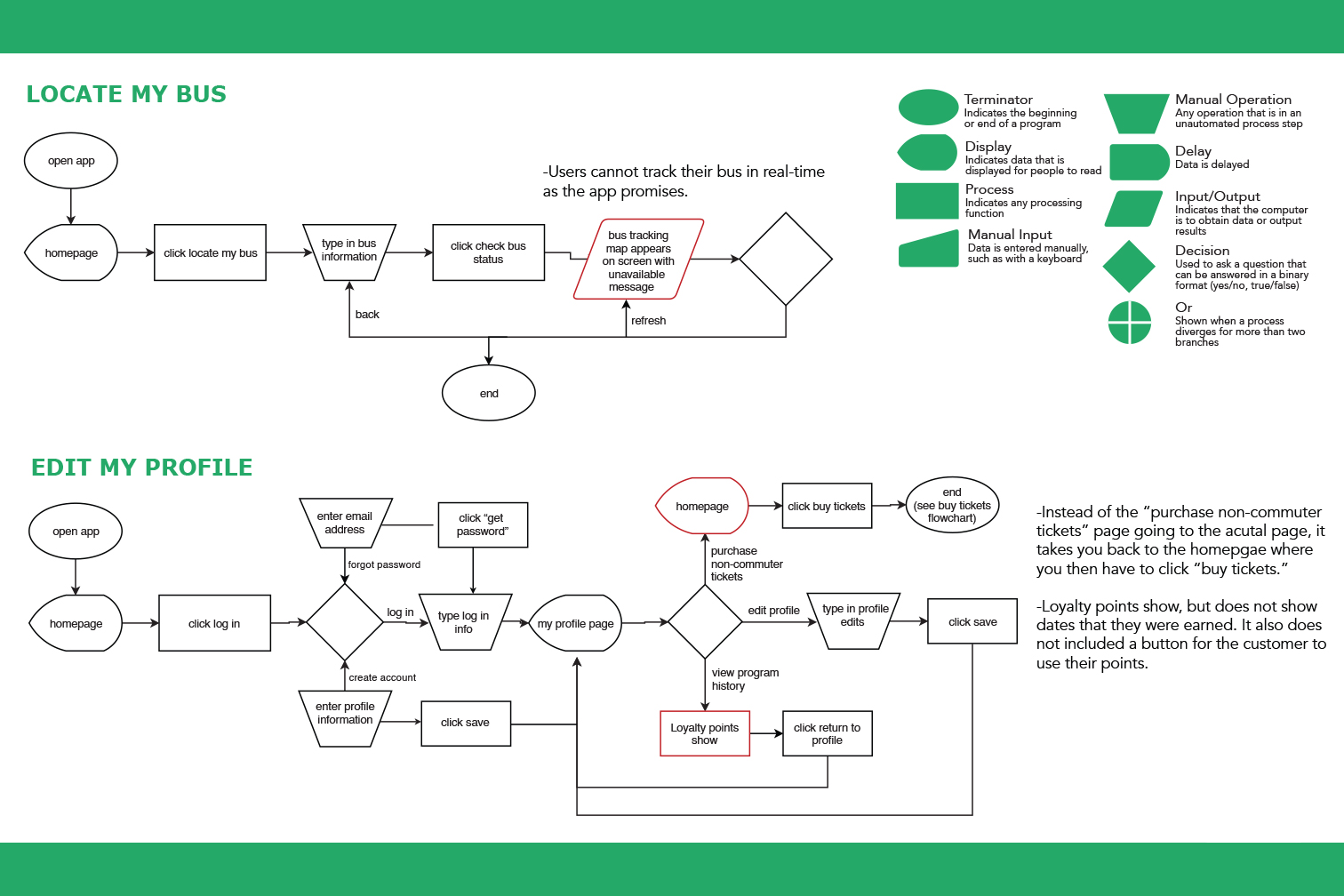
Peter Pan: Current State Sitemap and Flowcharts
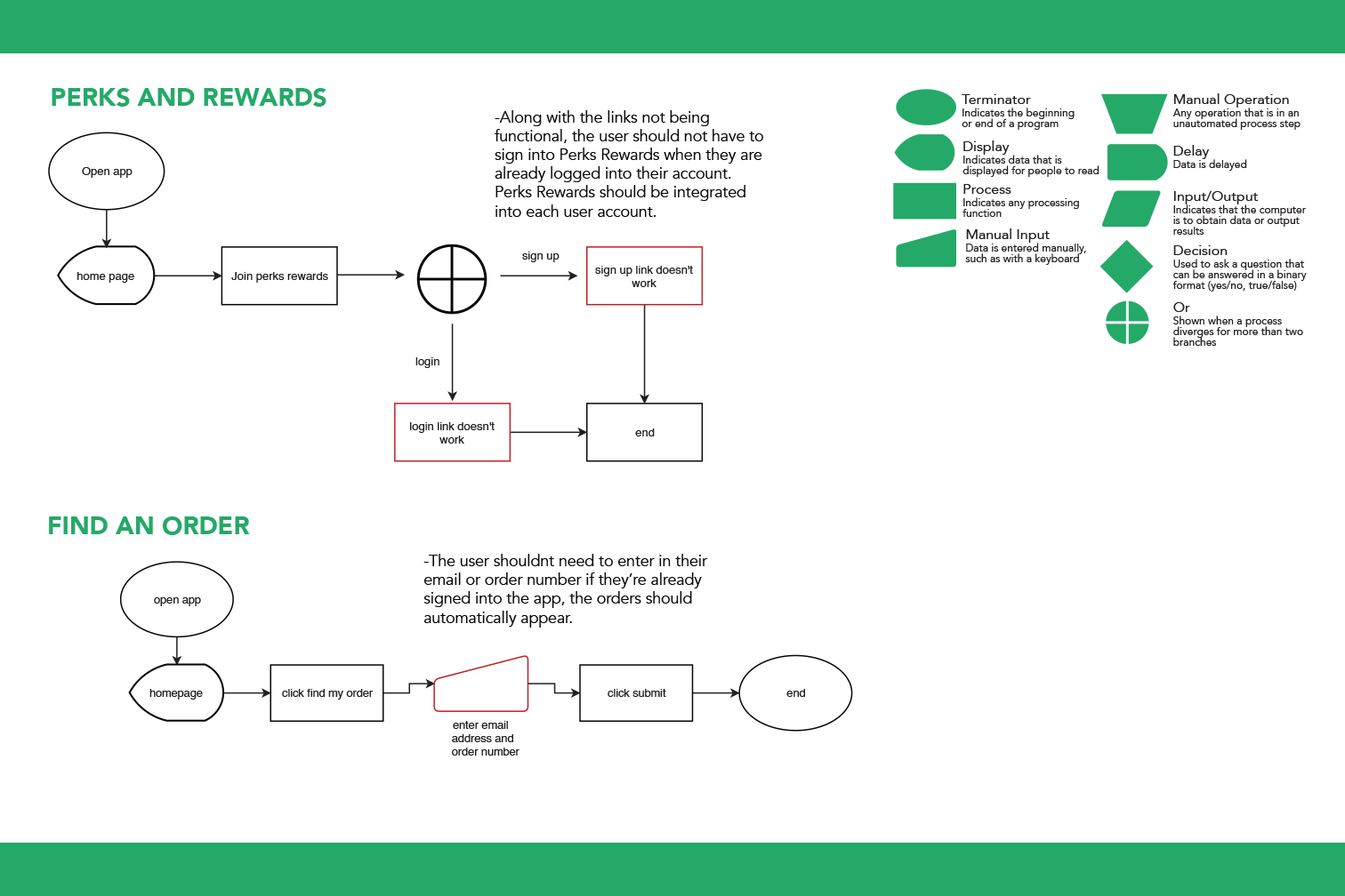
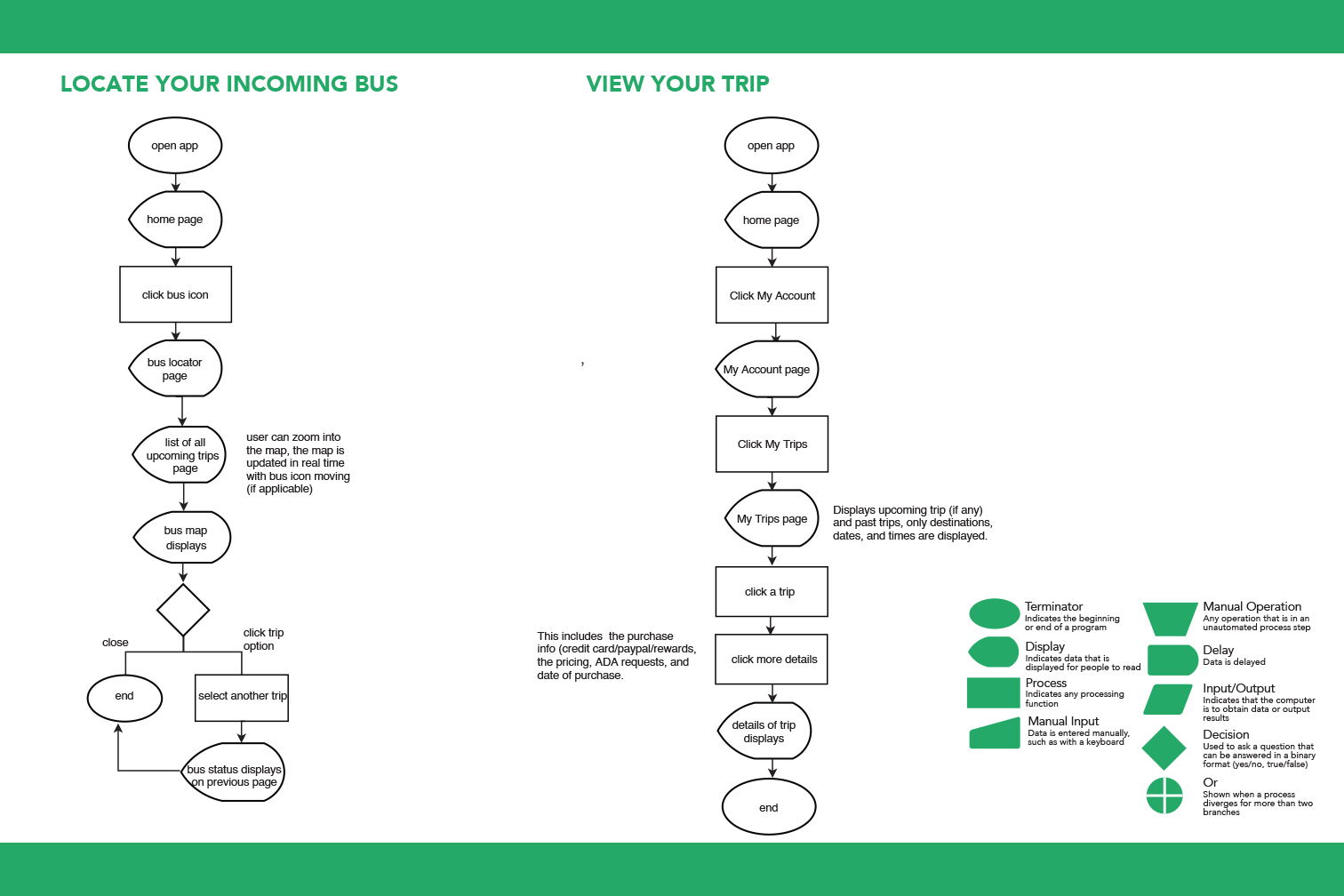
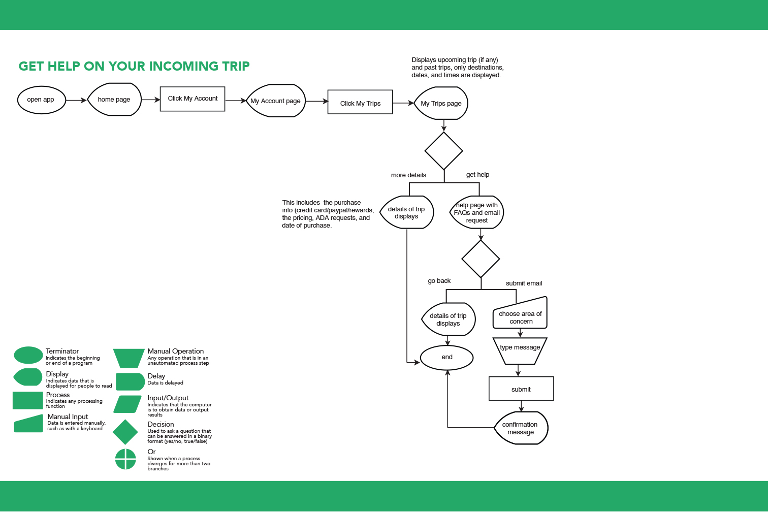
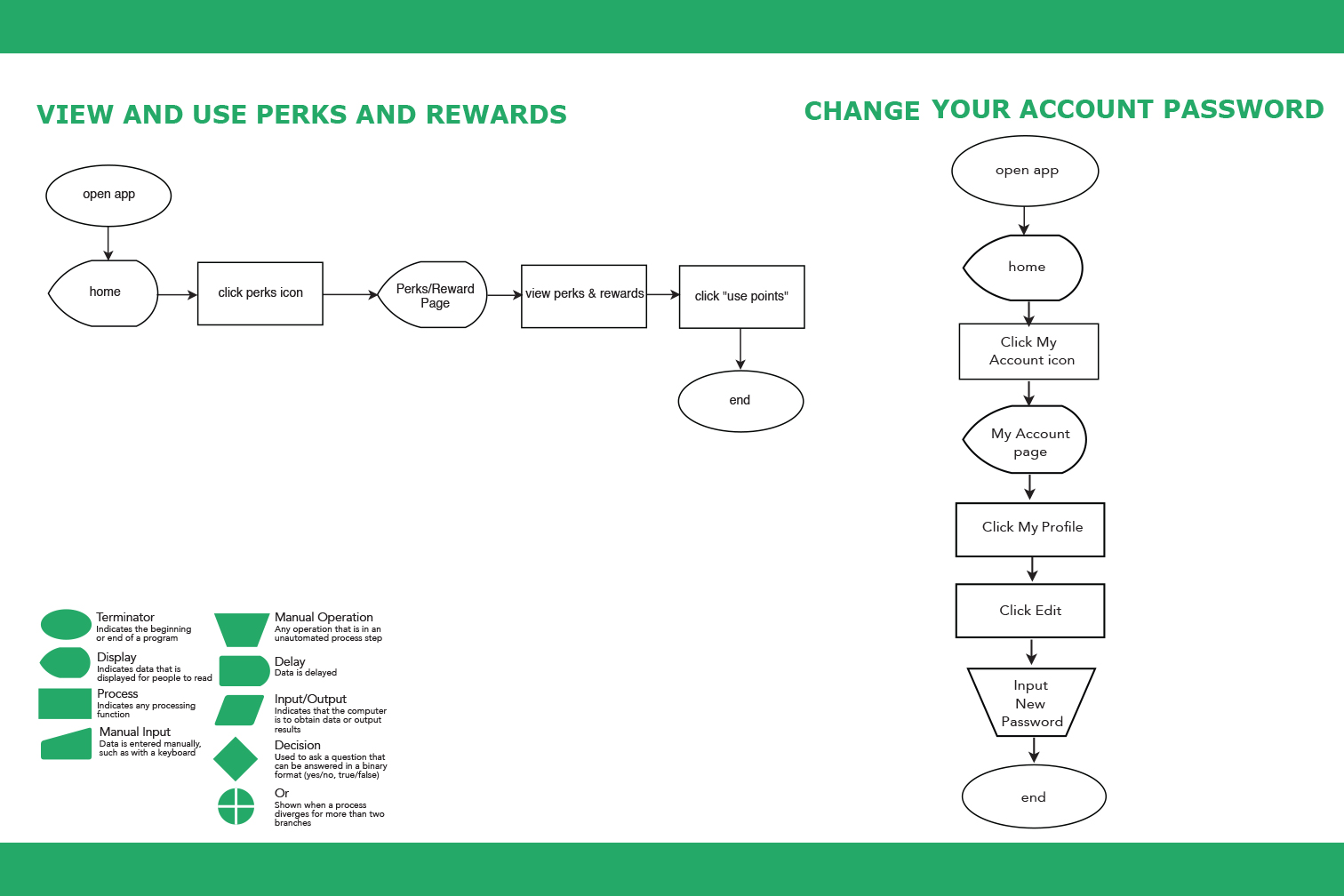
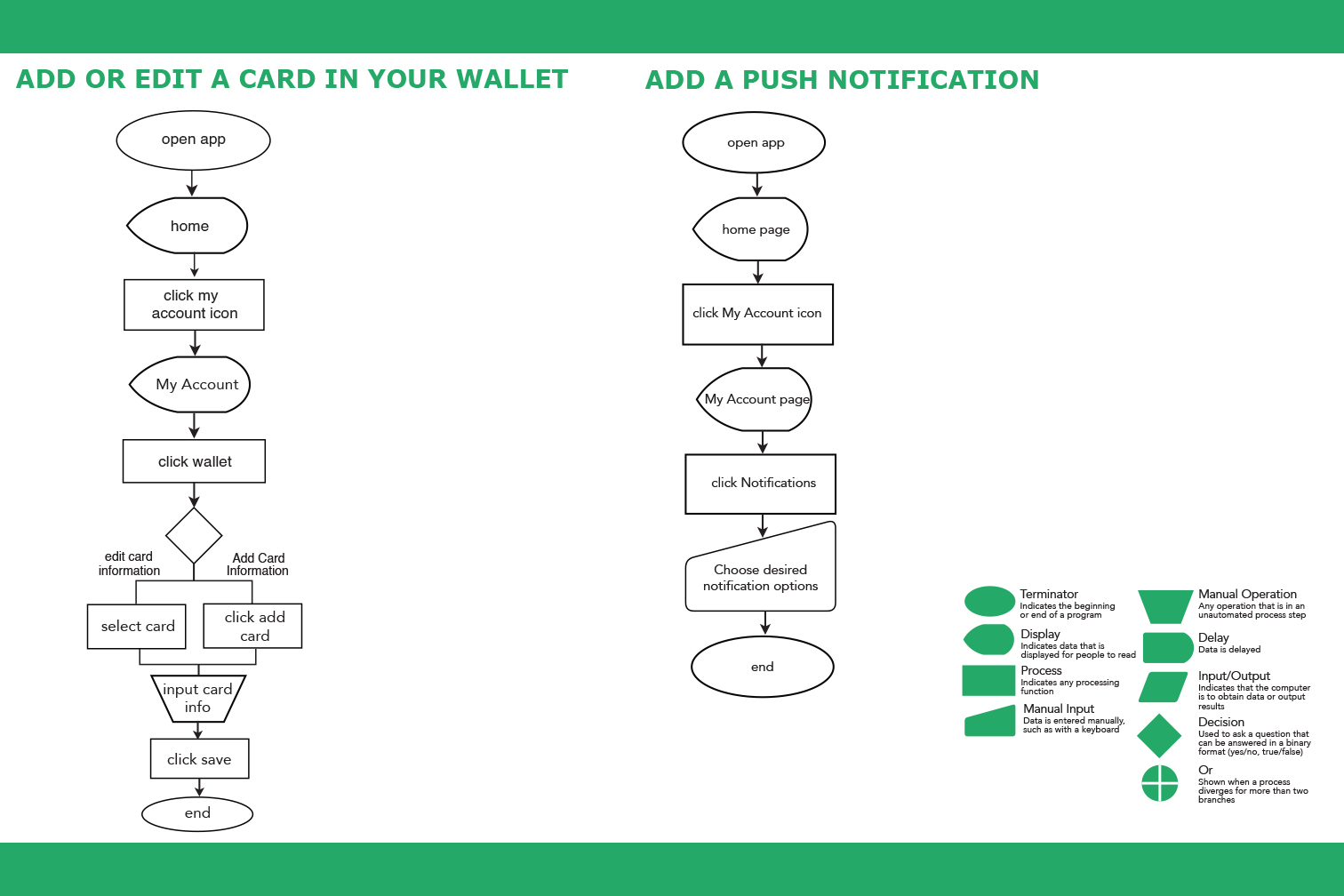
Peter Pan: Ideal State Flowcharts
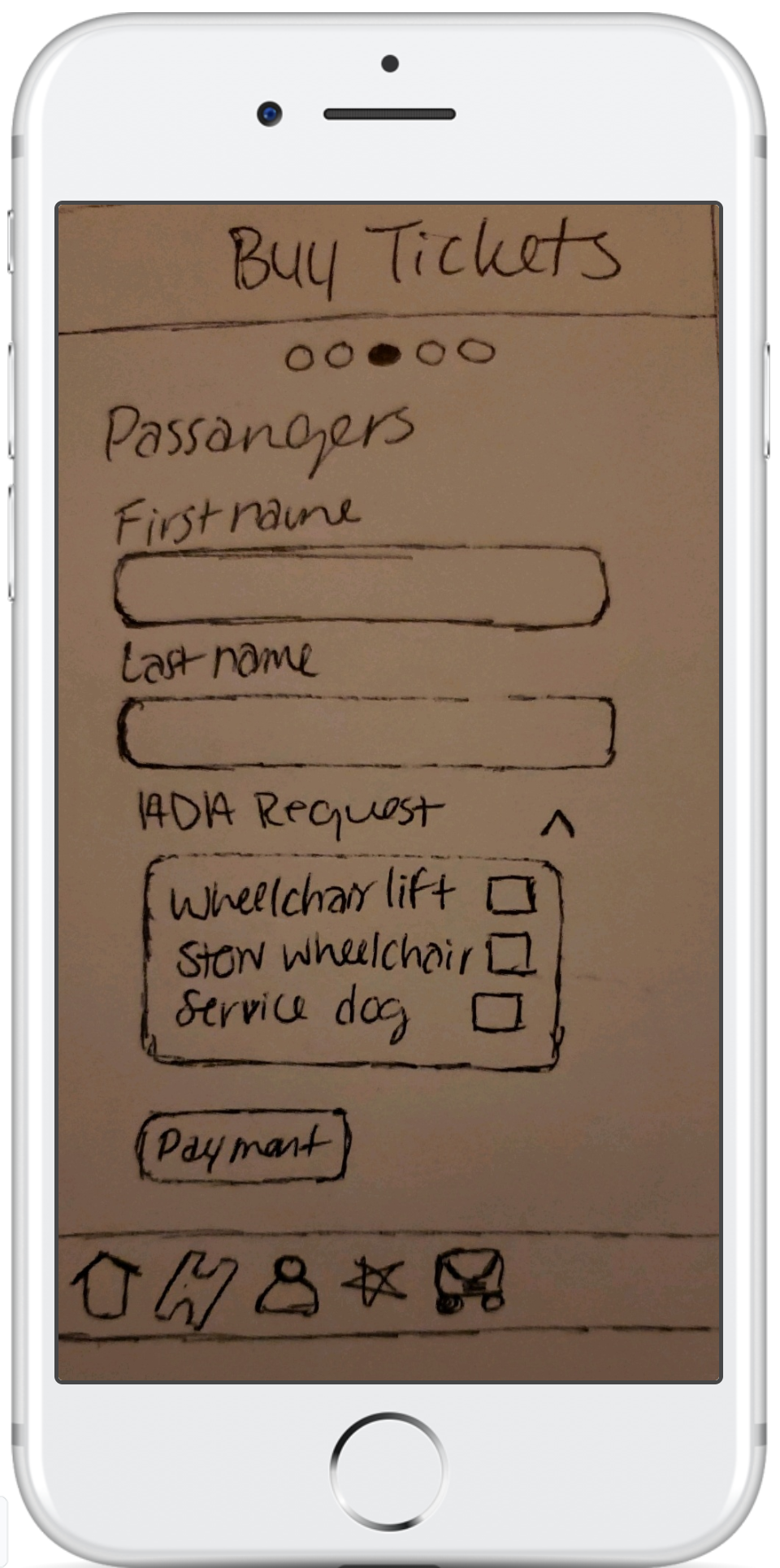
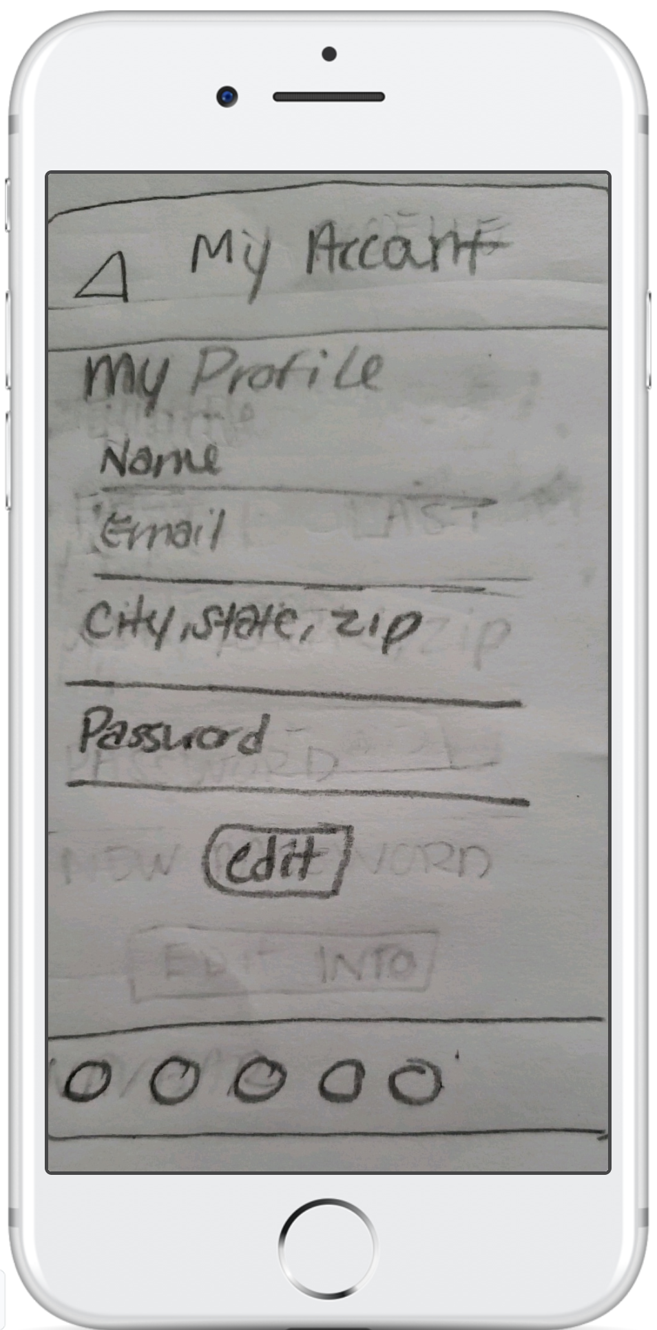
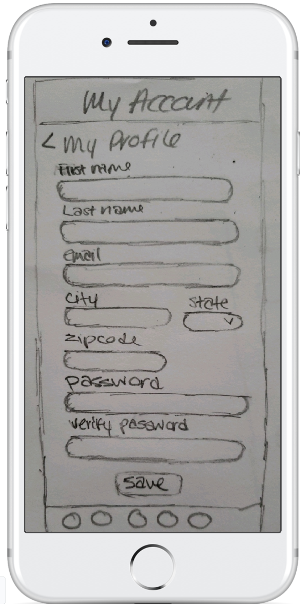
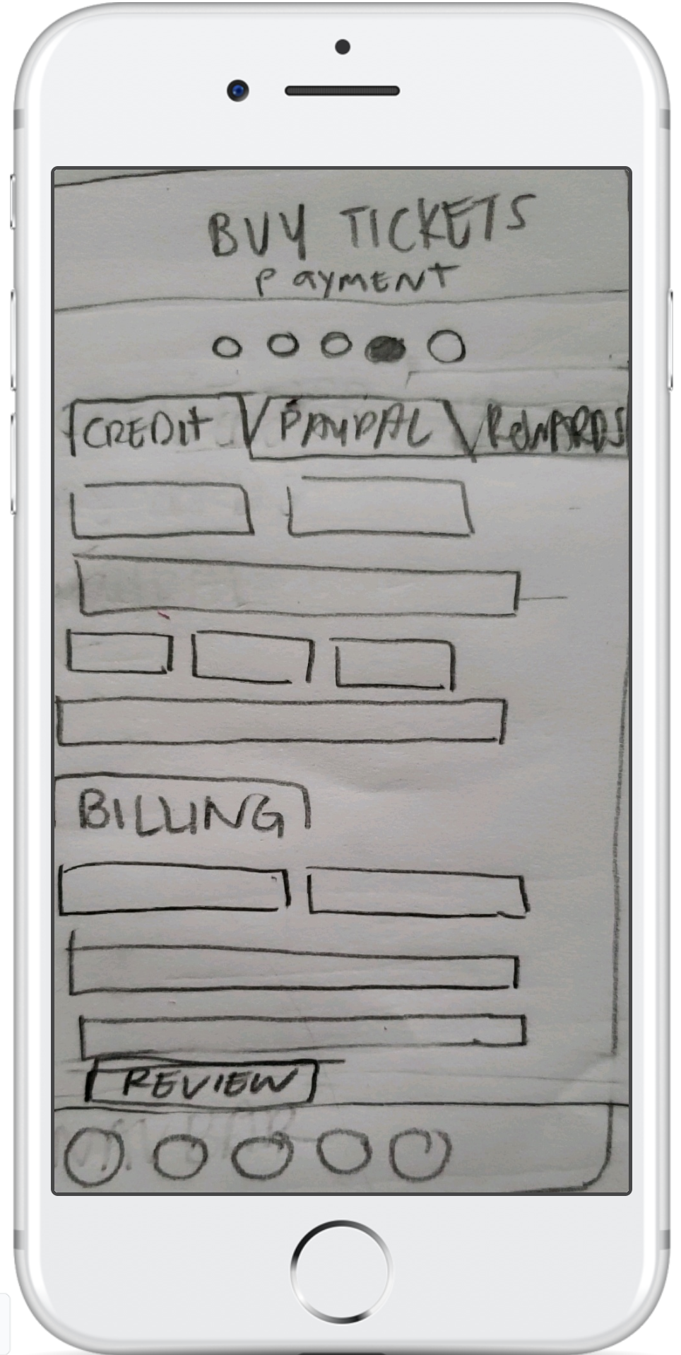
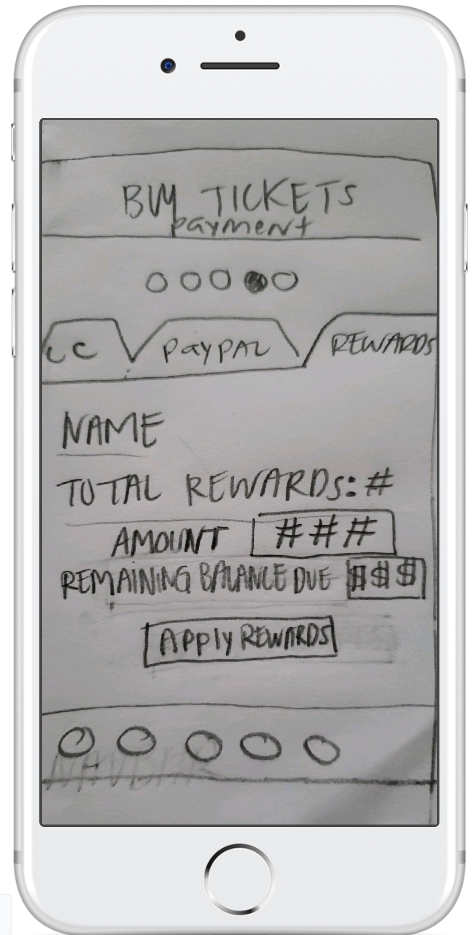
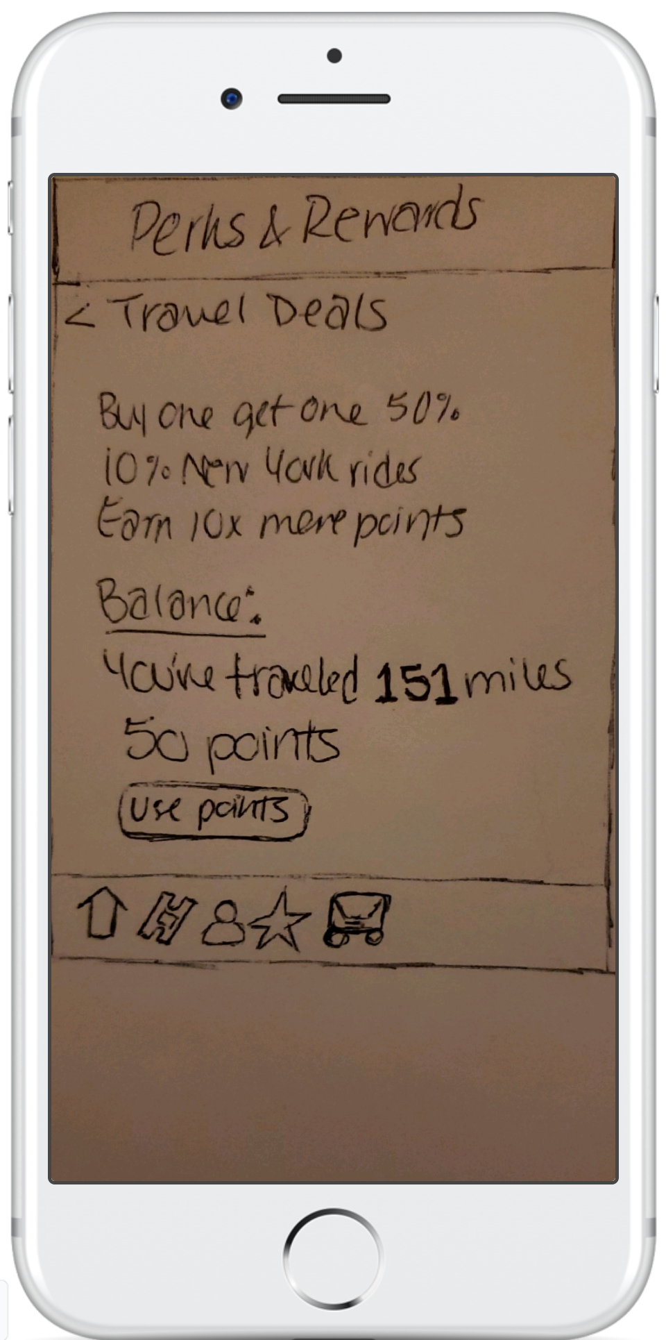
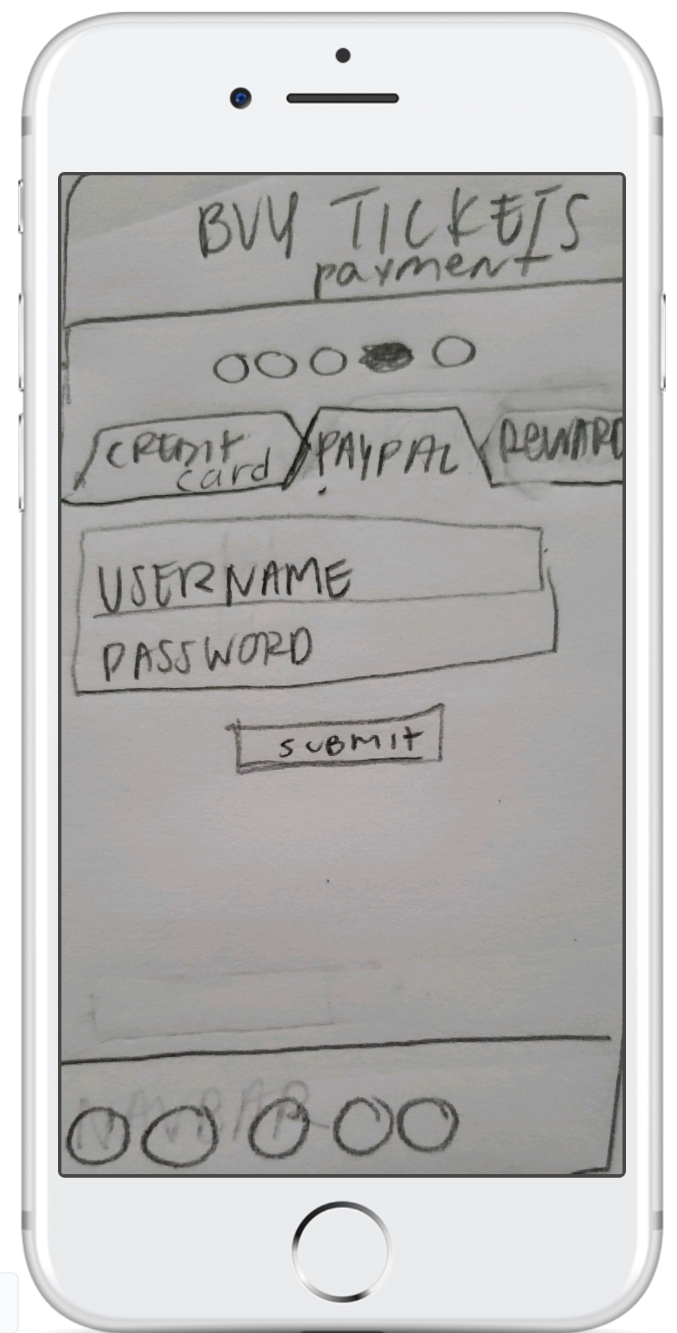
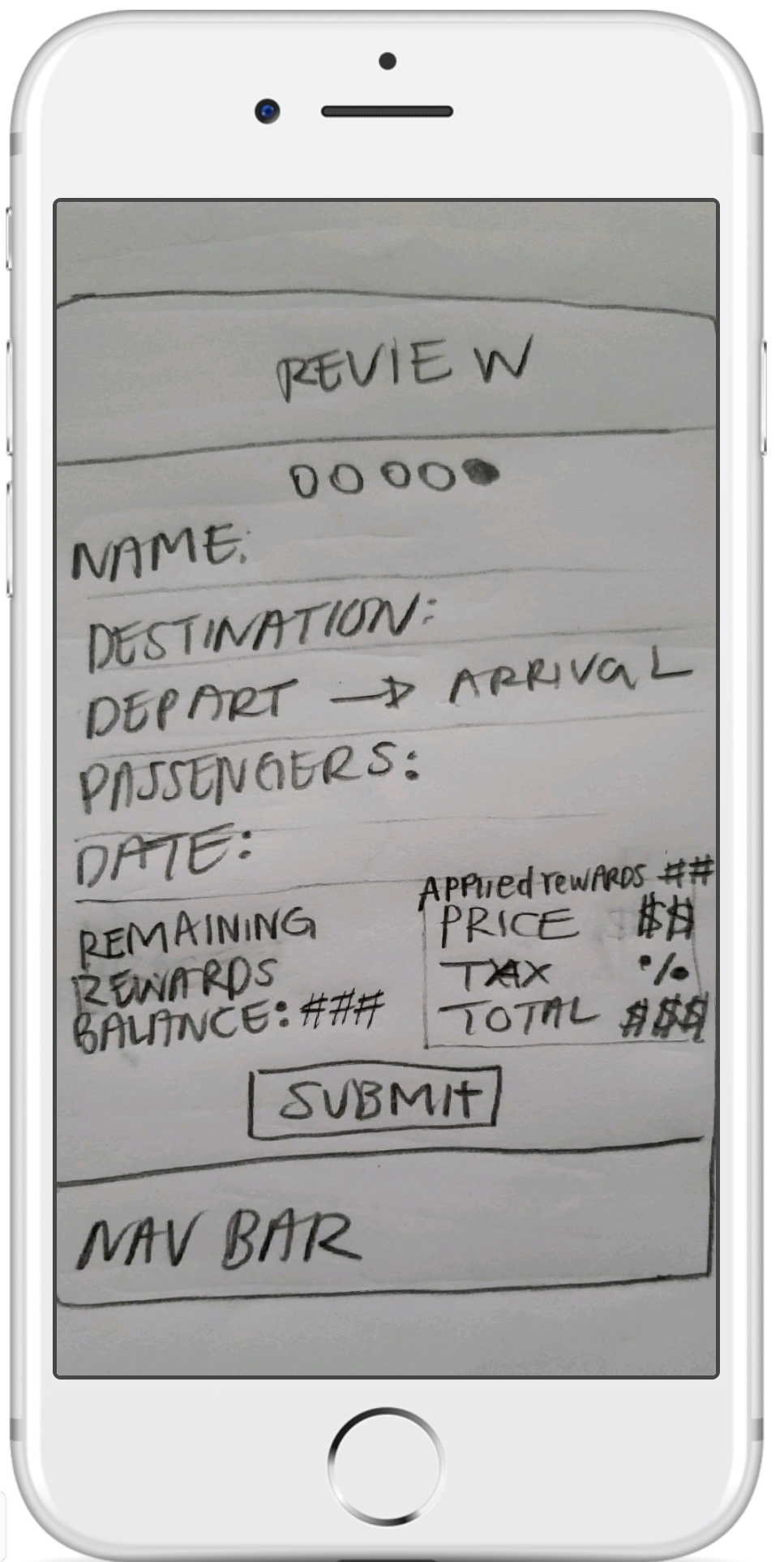
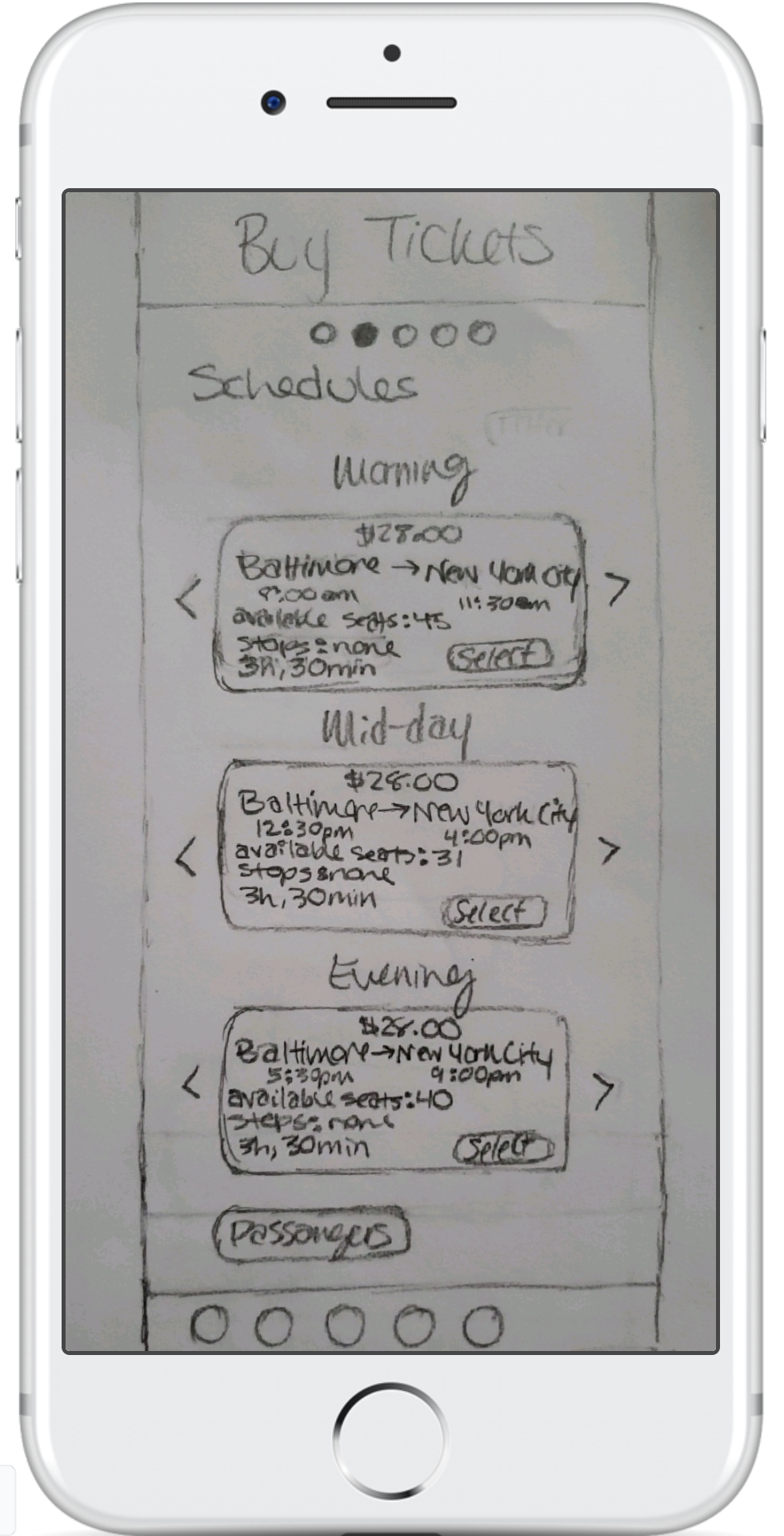
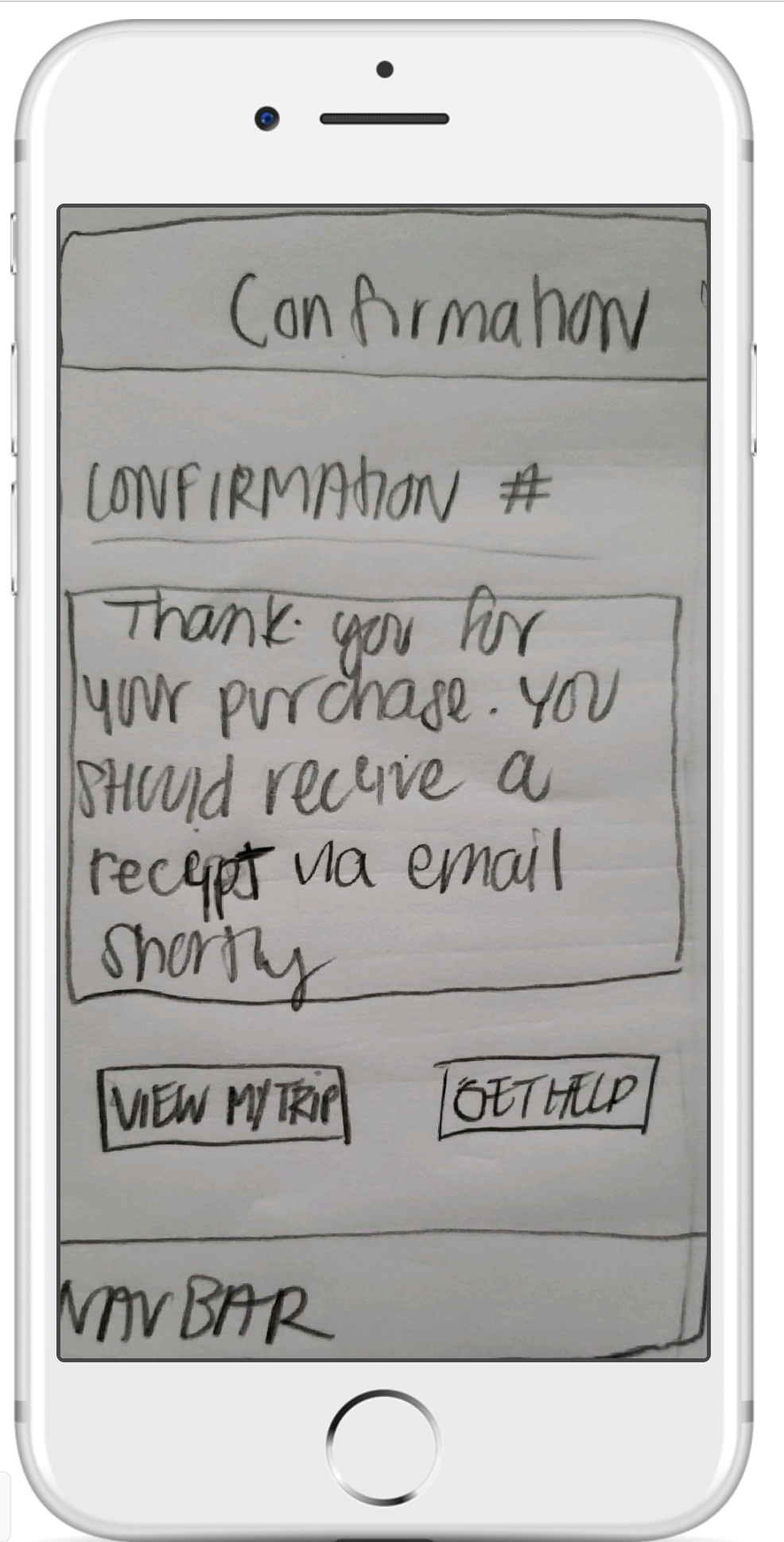
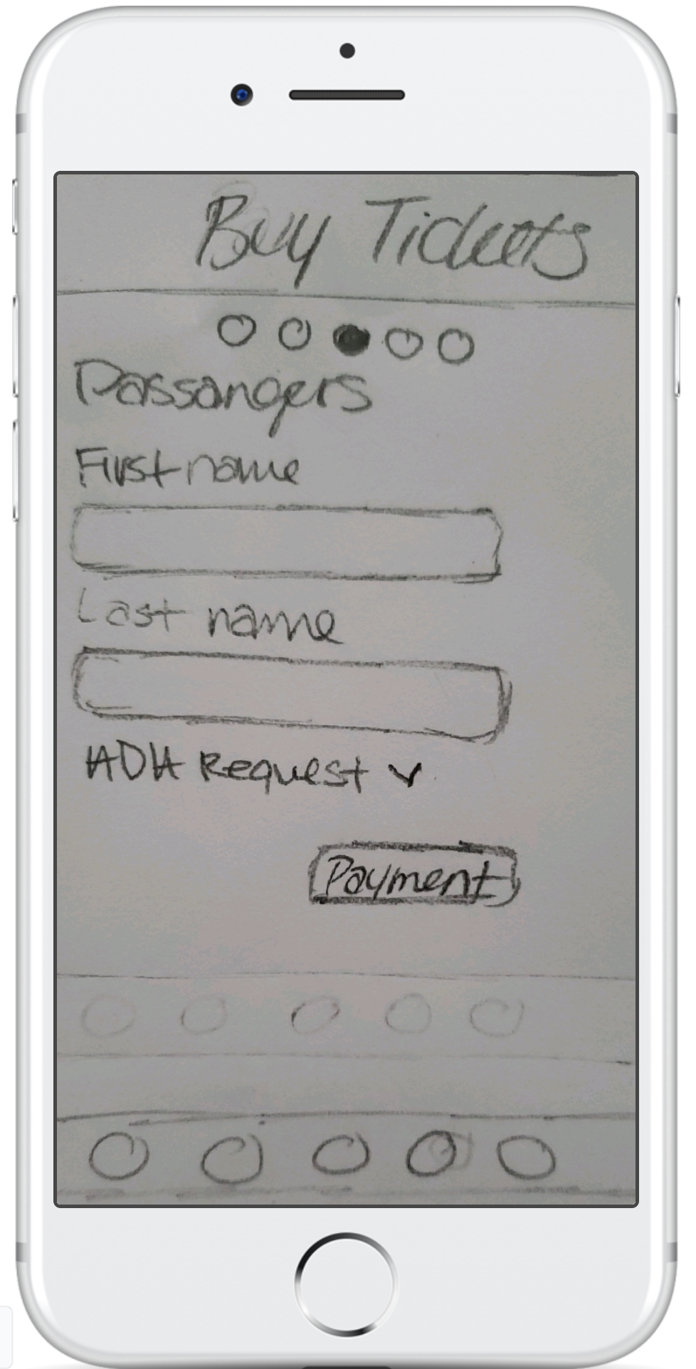
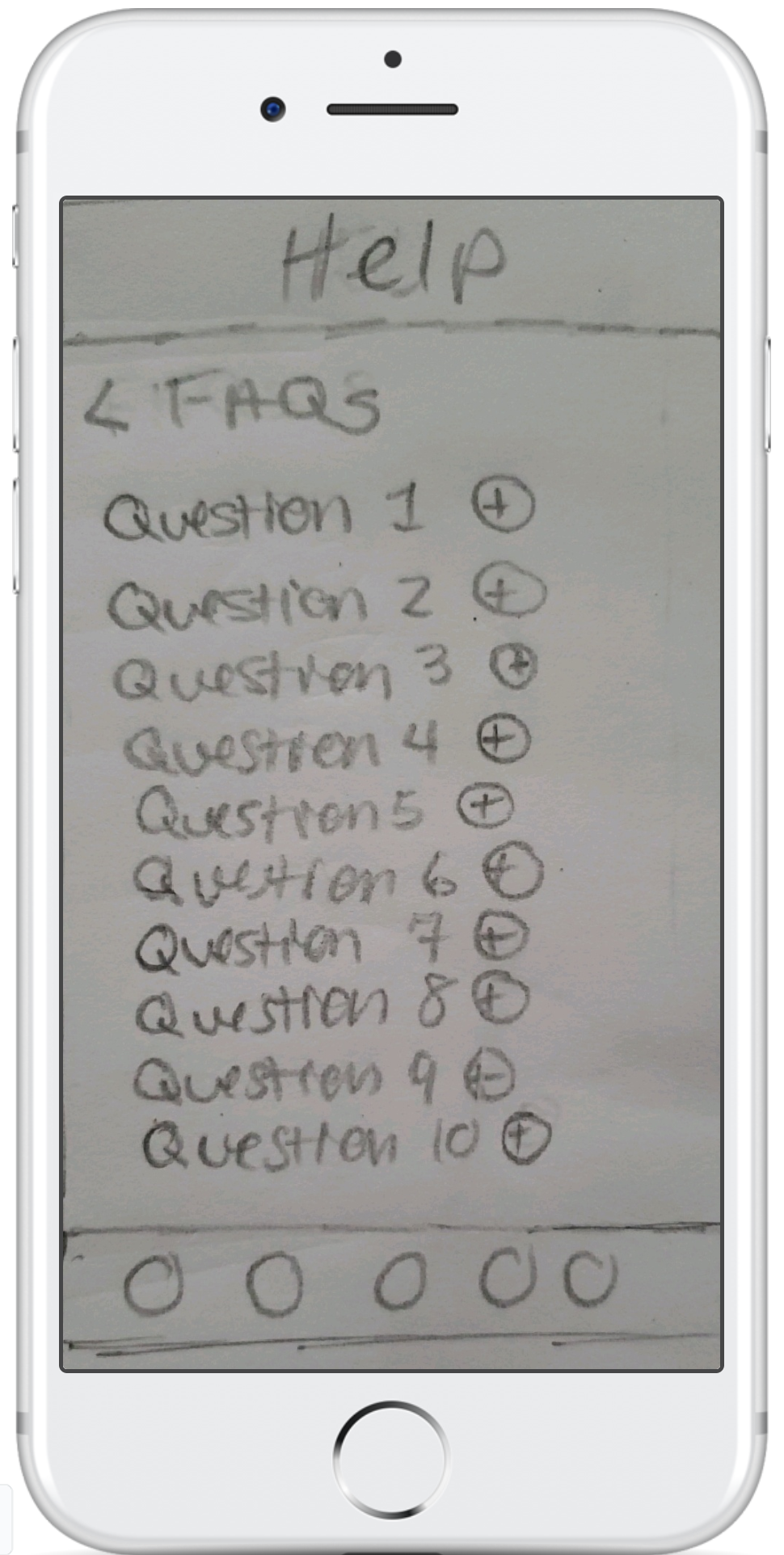
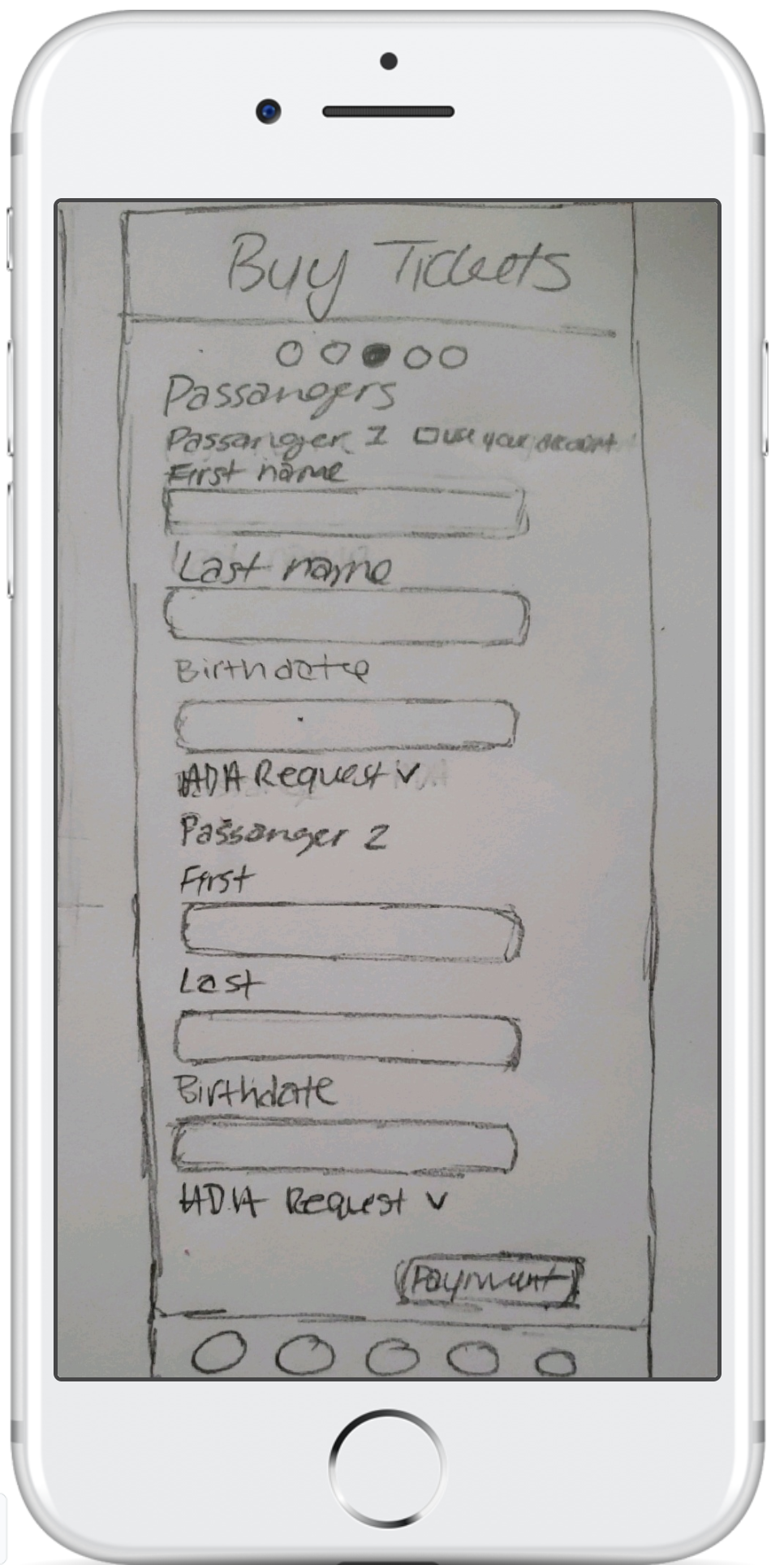
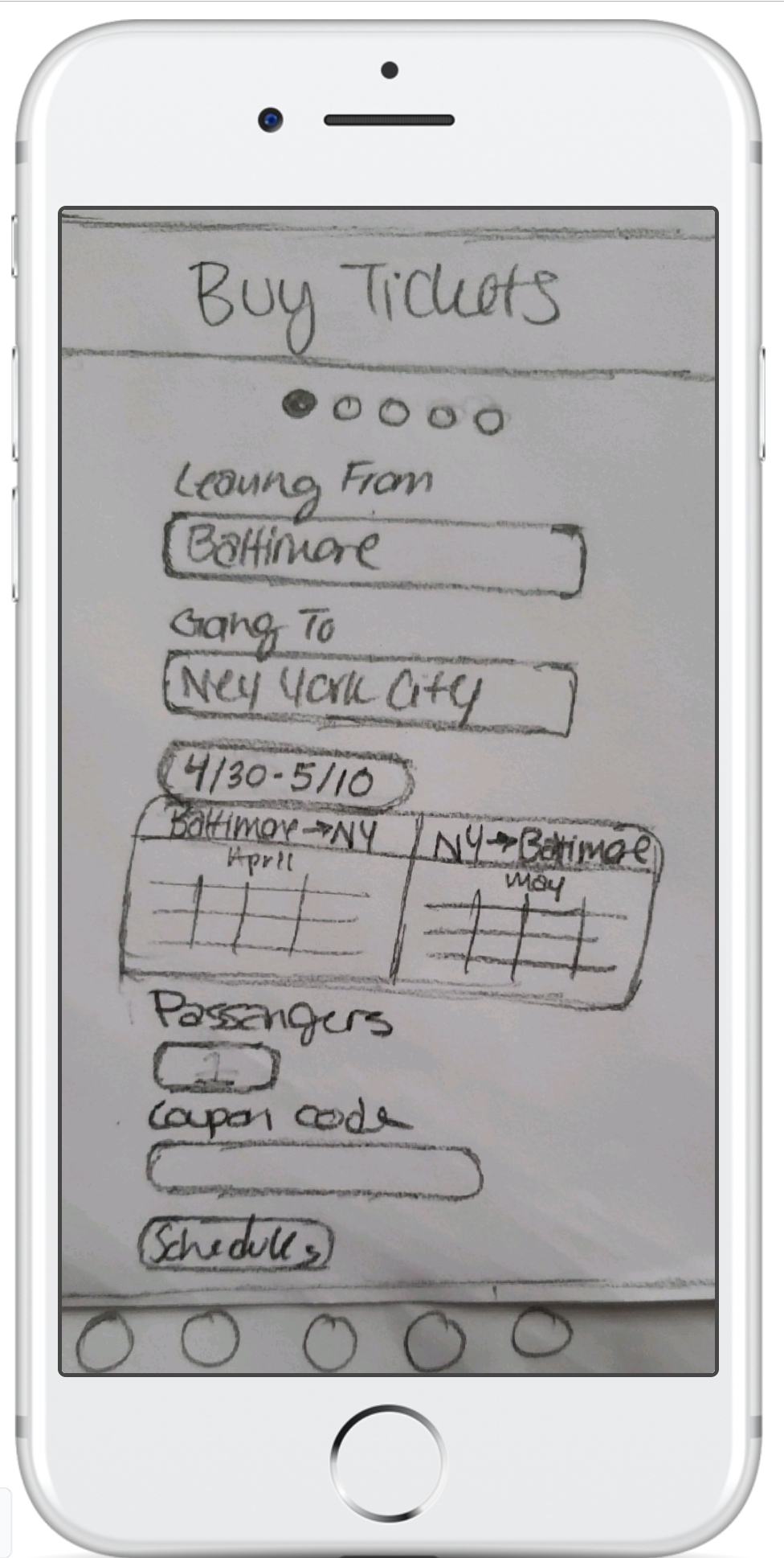
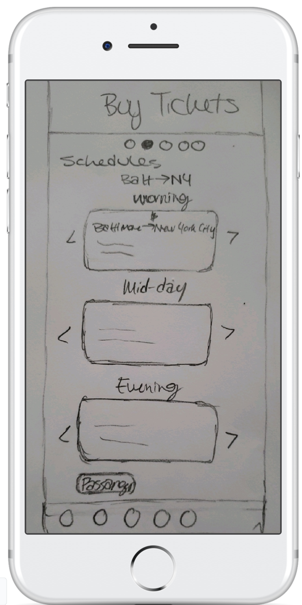
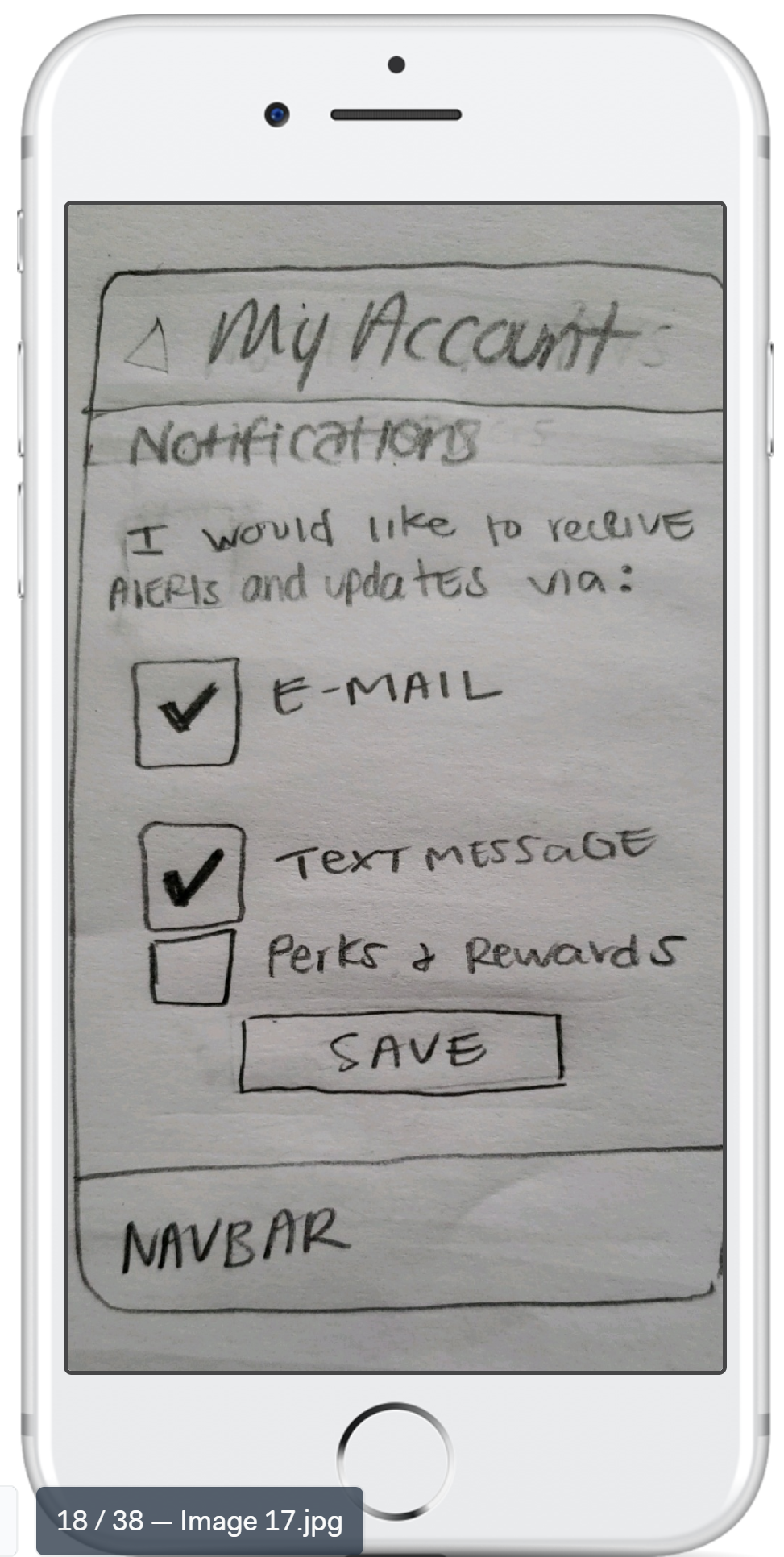
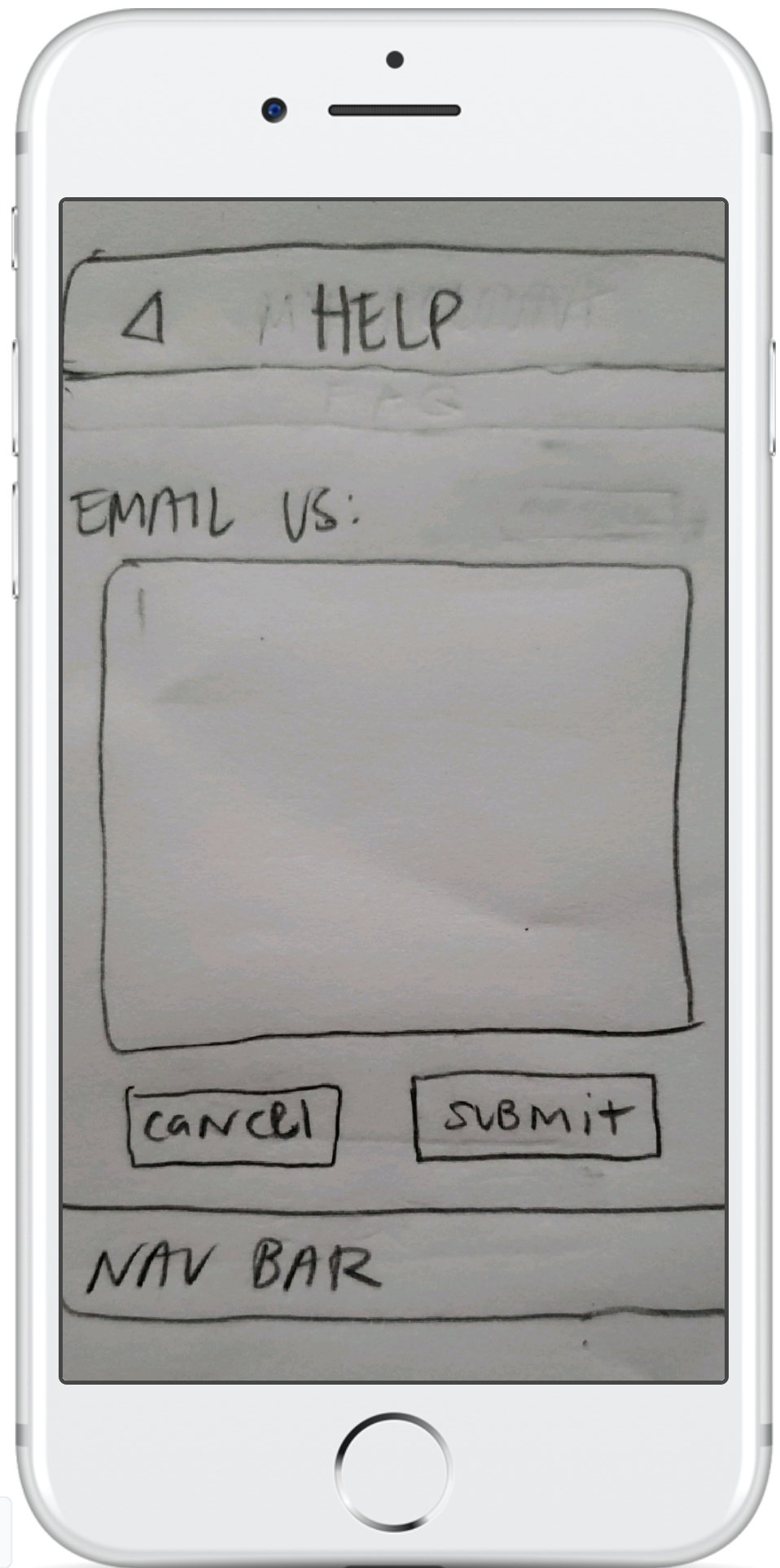
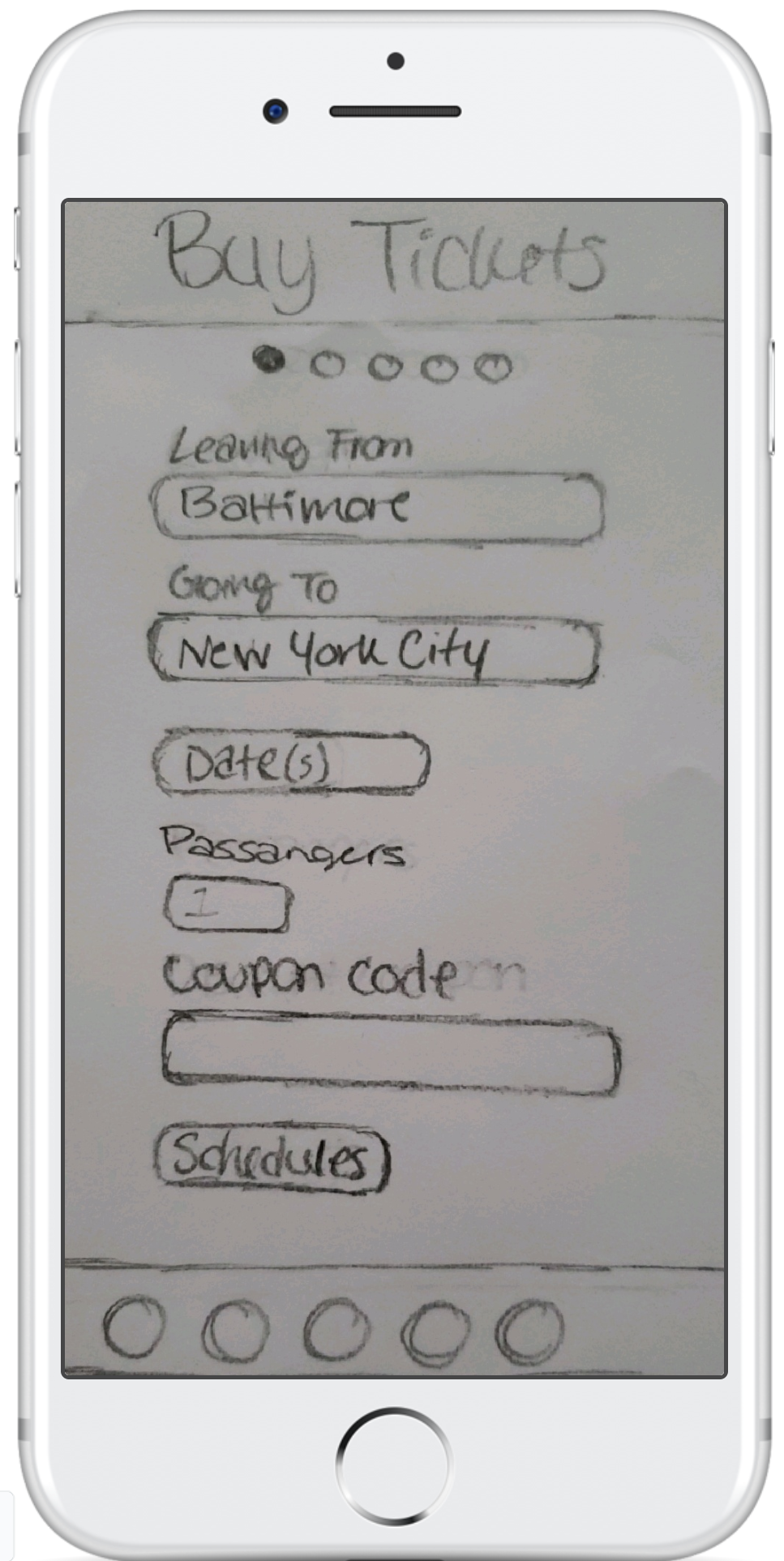
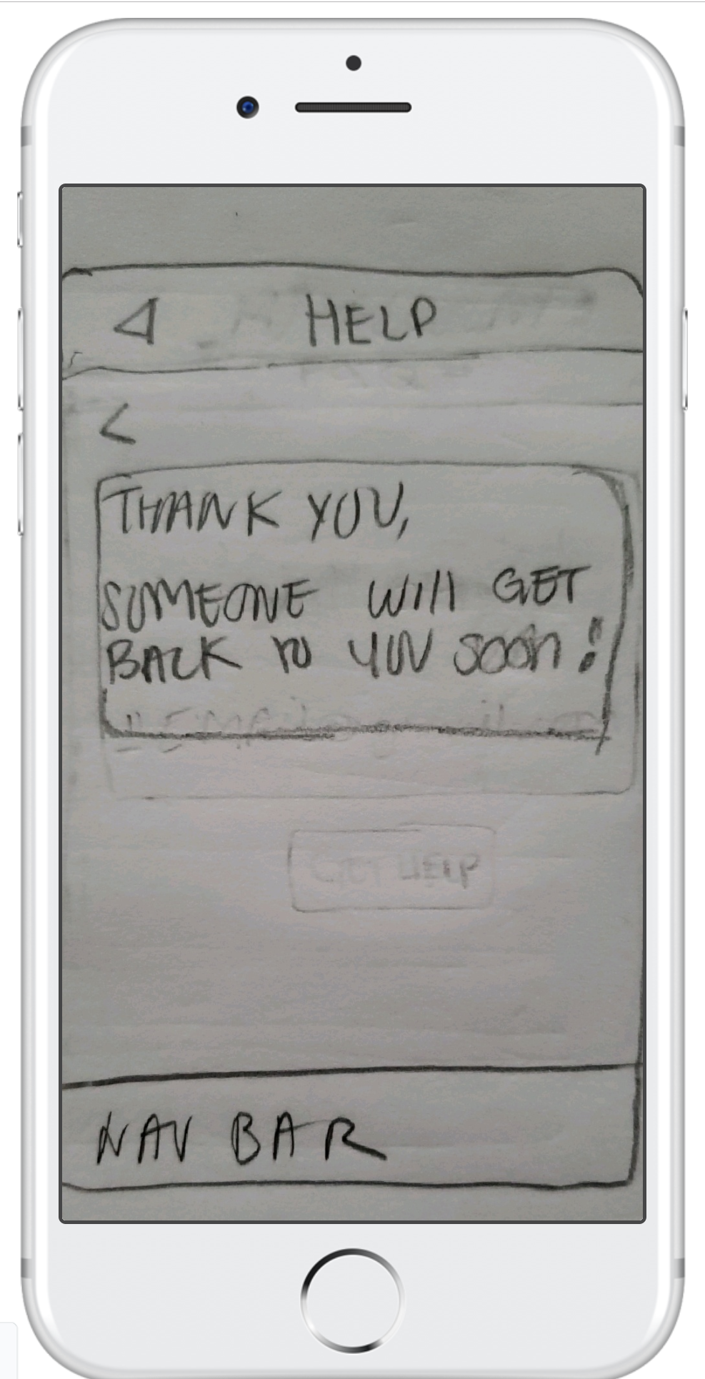
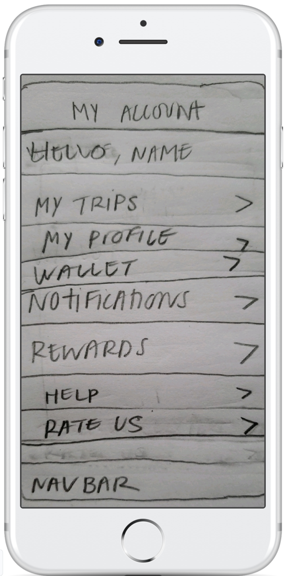
Low-Res Prototype
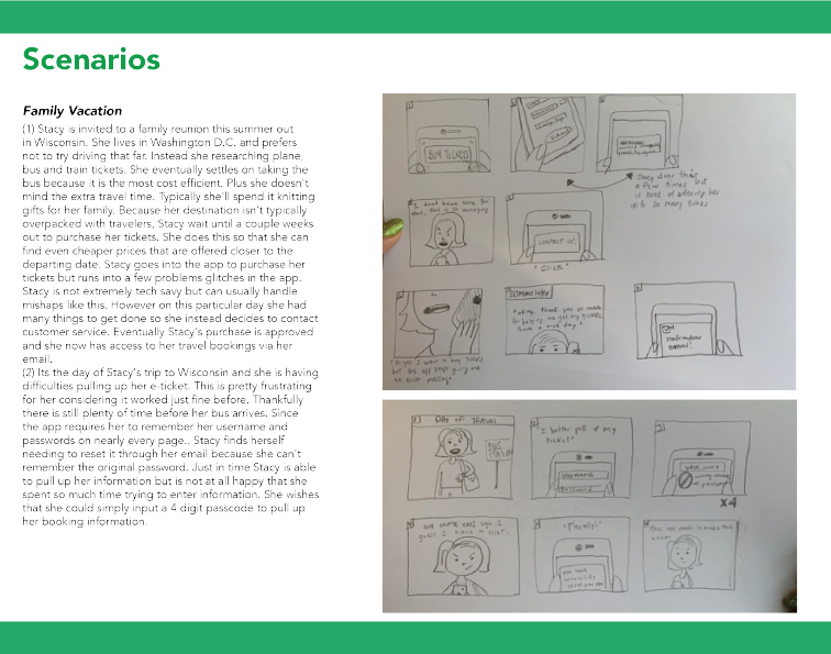
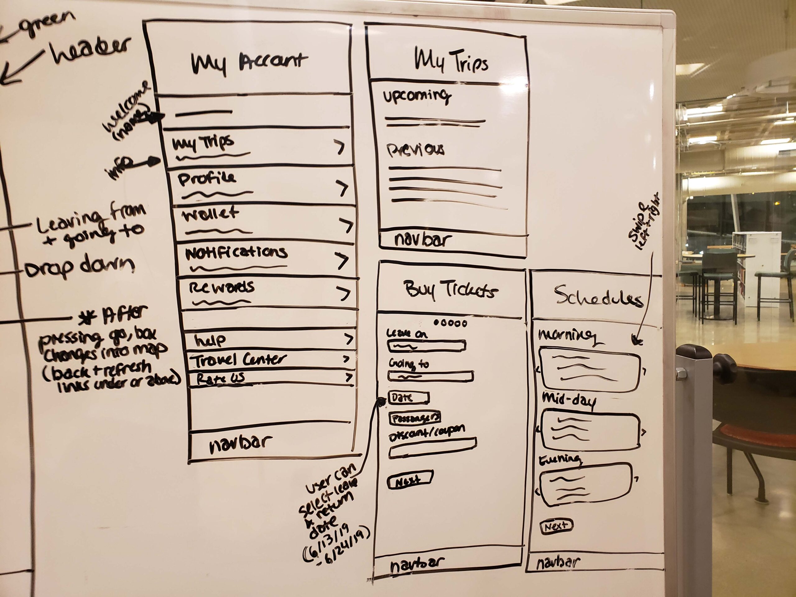
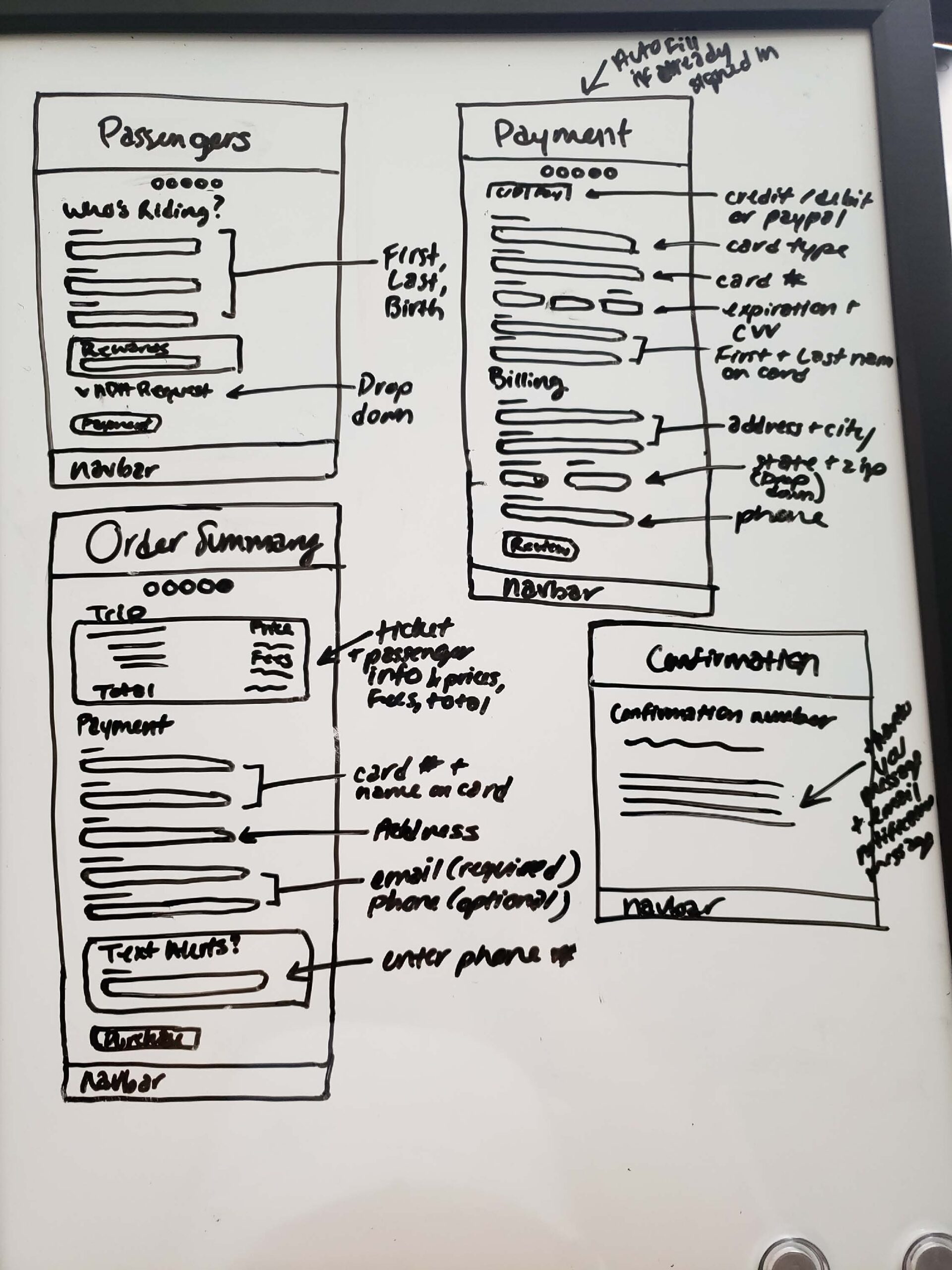
We began our first prototype by drawing them out on a whiteboard together so that we could make fast and easy edits. We wanted to make sure that we included all of our ideal features and followed our ideal flowcharts.
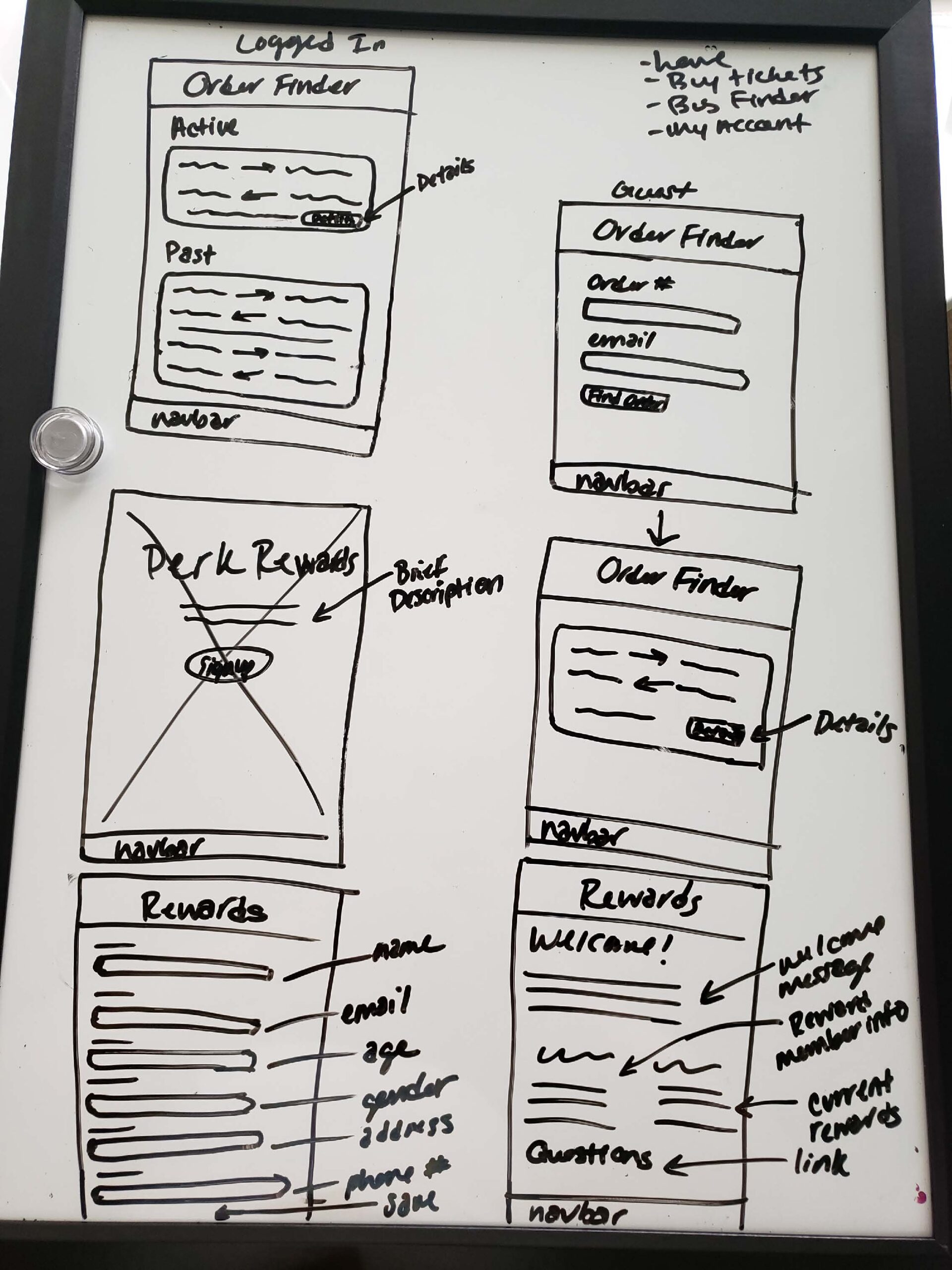
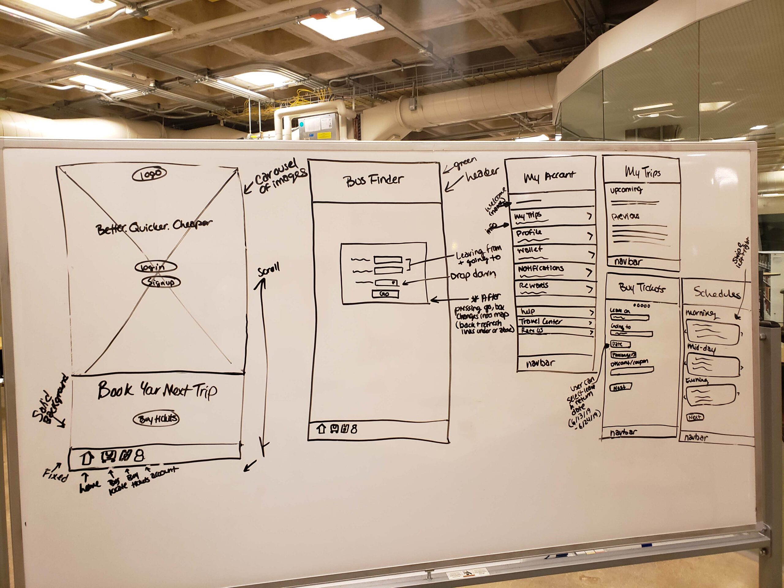
Low Res Process: User Testing
When we began drawing out the pages on paper to prepare them for our prototype, we quickly realized that some features weren’t working how they should, and neither were some of the visuals. We discussed changes that we should make before inputting them into the app, and then user-tested our pages before making our final low-res prototype. We chose which user edits were applicable, and made those changes along with our own edits.